Corporate Event Signage Design: How to Improve Brand Visibility and Attendee Navigation

Corporate Event Signage Design: How to Improve Brand Visibility and Attendee Navigation

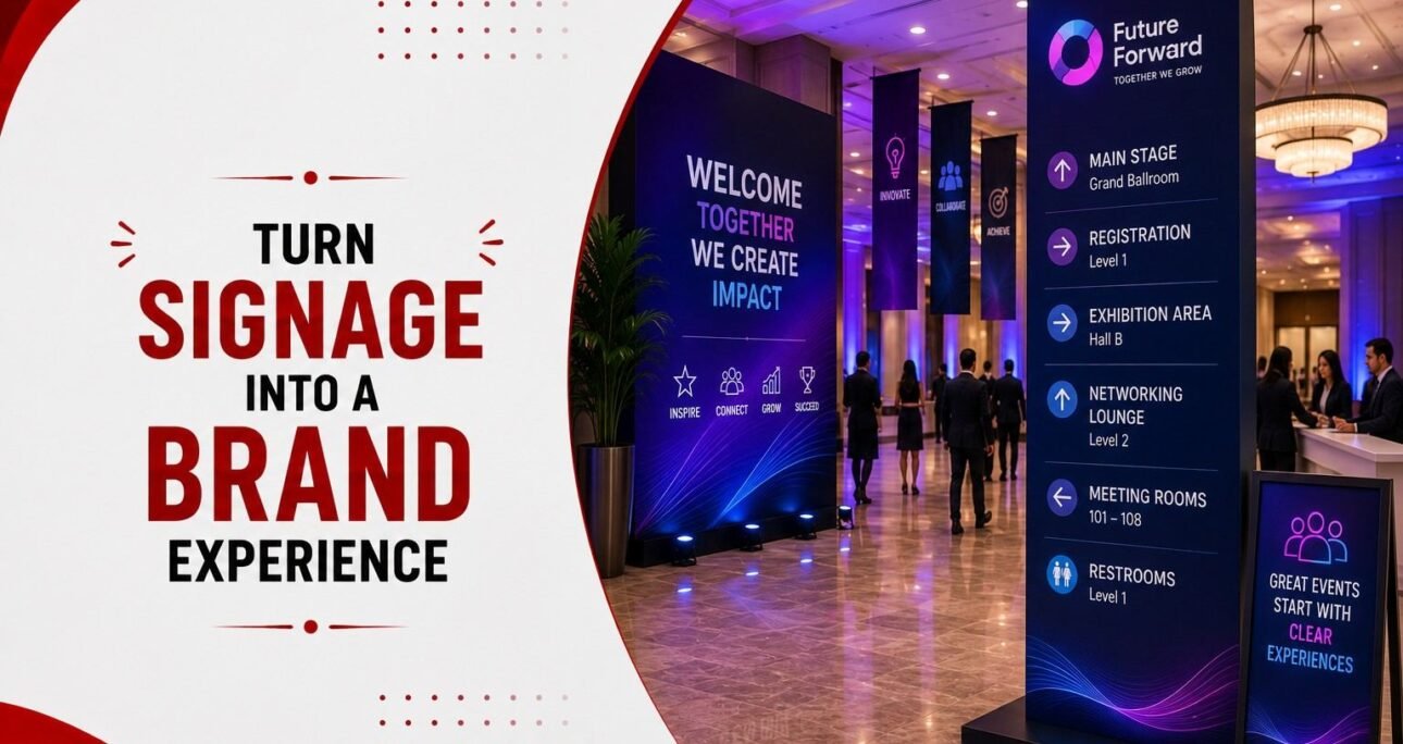
Corporate event signage has two jobs to do at the same time: help people find their way around a venue and make the brand visible throughout the experience. When these two functions work together, signage becomes part of the event design rather than something added at the last minute. From the entrance and registration desk to breakout rooms, networking areas and the main stage, each sign can help attendees understand where they are and what comes next. It can also reinforce the event’s visual identity through consistent colours, typography, graphics and messaging. The challenge is getting the balance right. A sign that looks impressive but is difficult to read does little for navigation, while a purely functional sign can miss an opportunity to strengthen the brand. Effective corporate event signage is designed around the attendee journey, the venue environment and the purpose of each communication point.
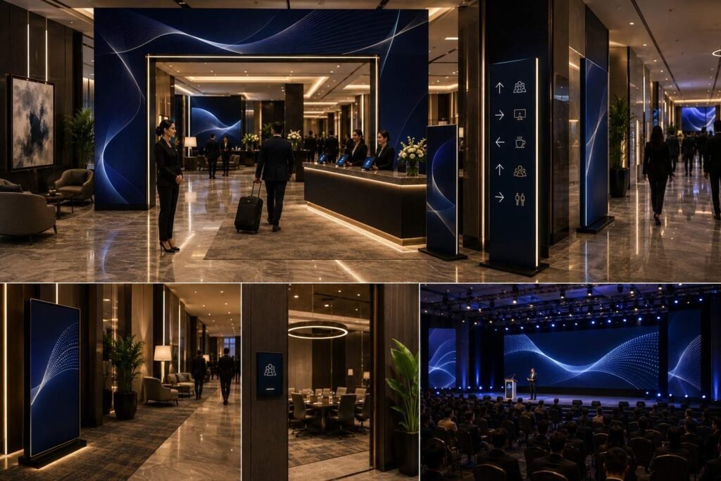
Corporate event signage design

What Is Corporate Event Signage?

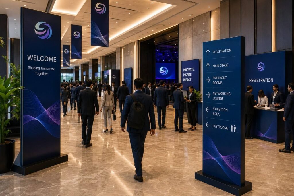
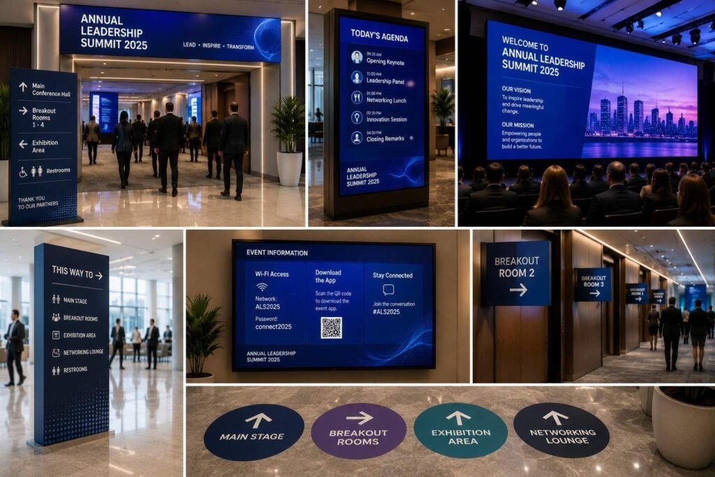
Corporate event signage is a planned system of visual communication used to guide attendees, provide essential information and reinforce a company’s brand throughout an event. It can include everything from entrance and registration signs to directional boards, room identifiers, stage graphics, floor graphics and digital displays. The purpose goes beyond telling people where to go. In a corporate event, signage becomes part of the environment attendees experience from the moment they arrive. A well-designed welcome sign establishes the event’s identity, while clear directional signage helps people move between registration, conference rooms, breakout areas, networking spaces and other destinations without confusion. The most effective corporate event signage combines function with visual consistency. Typography, colours, icons, messaging and graphic elements should work with the wider event branding rather than compete with it. At the same time, important information needs to remain immediately visible and easy to understand. This is why signage planning should begin with the venue layout and attendee journey, not simply with the artwork. Once the key routes, decision points and destinations are identified, the right signage can be designed for each stage of the experience.

Why Corporate Event Signage Matters

Why Corporate Event Signage Matters

Corporate event signage often has to work in a busy environment where attendees are arriving at different times, moving between sessions and looking for information while conversations, presentations and other activities are happening around them. Clear signage reduces the effort required to understand the venue while creating repeated opportunities for the brand to be seen.


Strengthening Brand Visibility

A company’s visual identity should not stop at the stage backdrop or registration counter. Branded signage can carry the same colours, typography, graphic language and messaging into corridors, meeting areas and other attendee touchpoints. This creates a more consistent environment and helps the event feel like one connected brand experience. The key is to use branding with purpose. A directional sign should make its instruction immediately clear before adding decorative elements or secondary messaging.


Making Navigation Easier

Attendees should not have to rely on event staff every time they need to find a room, networking area or registration desk. Event wayfinding signage provides visual cues that help people understand where they are and which direction to take. This becomes particularly important in large convention centres, hotels and multi-zone corporate events where several rooms or activities may be spread across different areas.


Supporting a Smoother Event Experience

Good signage can reduce small points of friction throughout the event. Clear registration instructions can help manage movement, room signs can make sessions easier to locate, and well-positioned directional signs can prevent people from stopping in busy corridors to ask for directions. These details may seem minor individually, but together they contribute to how organised and considered the event feels.


Connecting Function With Experience

The strongest corporate event signage design does not treat navigation and branding as separate tasks. A directional sign can guide an attendee while still looking like part of the event’s visual identity. A stage graphic can communicate the brand while creating a strong visual setting for presentations and photographs. The objective is not to put a logo on every available surface. It is to make each sign useful first, while ensuring that the collection of signs creates a consistent experience from arrival to departure.

Design Signage Around the Attendee Journey

Effective event signage and wayfinding should follow the way people actually move through a venue. Instead of deciding where signs should go after the creative design is finished, start by mapping the attendee journey and identifying the points where people need information. At arrival, attendees need to know that they have reached the right venue or entrance. Once inside, they may need directions to registration, the main event space or a particular session. Later, they may need to find breakout rooms, networking areas, dining spaces or exhibition zones. Each stage requires a different type of visual cue.


Arrival and Registration

The first signs should establish recognition and orientation. Entrance branding can confirm that attendees are at the right event, while registration signage should make the check-in process easy to understand. If there are separate counters for speakers, VIPs, general attendees or other guest categories, those distinctions should be visible before people reach the queue. This prevents unnecessary stopping and keeps movement more organised.


Moving Through the Venue

Once attendees leave registration, corporate event wayfinding becomes more important. Directional signs should appear before important decision points, giving people enough time to understand their options and choose a route. For example, if two corridors lead to different breakout rooms, the sign should appear before the junction rather than after it. A confirmation sign further along the route can then reassure attendees that they are still heading in the right direction.


Sessions and Networking

Room identification should be consistent across the venue. Session names, room numbers and other essential information should have a clear visual hierarchy so attendees can recognise the correct destination quickly. Networking areas, dining spaces and activity zones also benefit from clear identification. These signs can carry elements of the event branding without making the information difficult to read.


Departure

The attendee journey does not end when the main programme finishes. Exit routes, parking, transport and other departure information can help people leave the venue without unnecessary confusion. Thinking about signage from arrival to departure creates a connected system rather than a collection of individual signs. Each sign has a purpose, and each one supports the next stage of the journey.

Build a Clear Signage Hierarchy

Not every piece of information on an event sign deserves the same visual weight. When attendees are walking through a busy venue, they should be able to understand the main message within a few seconds. A clear signage hierarchy makes that possible by deciding what people need to see first, what can come second and what can be left out. For corporate events, a useful approach is to think about signage in four roles: find, confirm, inform and engage.


Find: Help Attendees Reach the Right Place

Directional signage answers the most immediate question: Where do I need to go?  Use short destination names, clear arrows and familiar icons wherever appropriate. If several rooms or zones are involved, consistent naming becomes particularly important. Calling the same location “Hall A” on one sign and “Main Conference Room” on another can create unnecessary confusion.


Confirm: Reassure Attendees They Are on Track

Wayfinding does not stop after someone follows an arrow. Confirmation signs can reassure attendees that they have taken the correct route. For example, a sign reading “Breakout Rooms A–C →” can direct people towards a corridor, while a smaller room identifier at the destination confirms they have arrived at the right place.


Inform: Provide Useful Details

Some signage needs to communicate more than direction. Session timings, registration instructions, venue maps or event schedules can provide additional information, but the content should still be prioritised. The most important message should stand out first. Supporting information can be smaller or placed separately so the sign does not become difficult to scan.


Engage: Add to the Brand Experience

Not every sign needs to be purely functional. Branded graphics, sponsor messages, QR codes, photo opportunities and experiential installations can encourage attendees to interact with the event environment. The distinction is important: functional signage should never sacrifice clarity for branding. A directional sign may carry the company’s visual identity, but attendees should still be able to spot the destination and direction immediately.


Make the Hierarchy Consistent

Typography, colour, iconography and spacing should follow a consistent system throughout the venue. Attendees should be able to recognise related signs quickly, even when they encounter them in different areas. A strong corporate event signage design therefore creates a visual language that is easy to follow. When the hierarchy is consistent, attendees spend less time working out what a sign means and more time engaging with the event itself.

How Corporate Event Signage Improves Brand Visibility

Brand visibility at a corporate event is not created by placing a large logo on the stage and leaving it there. Attendees experience the brand through multiple touchpoints as they enter the venue, register, move between sessions, interact with displays and leave the event. Branded event signage can connect these touchpoints and make the overall environment feel consistent.


Extend the Brand Beyond the Stage

The registration area, entrance, corridors, breakout rooms and networking spaces all provide opportunities to reinforce the brand. Consistent use of brand colours, typography, graphic elements and messaging helps attendees recognise that these different areas belong to the same event experience.


Give Functional Signs a Brand Language

Event branding and signage should work together, but that does not mean every sign needs the same amount of branding. Functional signs need to prioritise clarity, while prominent areas such as entrance displays, stage backdrops and photo zones can carry stronger visual branding. Attendees should never have to search through a decorative design to find a room name or directional arrow.


Create Consistency Across Touchpoints

A well-planned signage system uses the same visual language across the event. Colours, fonts, icons, layouts and terminology should feel connected whether an attendee is looking at a registration sign or a directional board. This consistency helps attendees recognise information quickly while reinforcing the brand throughout their journey.


Make High-Traffic Areas Work Harder

Entrances, registration areas, stage surroundings, networking spaces and major intersections can become important, branded touchpoints. These areas should be designed with the wider event environment in mind. Signage needs to work alongside lighting, stage design, LED screens, furniture and other production elements rather than competing with them. The strongest corporate event branding uses signage to create a connected visual experience. It is visible enough to reinforce the brand, but purposeful enough that attendees never feel they are navigating through advertising.

Types of Corporate Event Signage

Types of Corporate Event Signage

Different signs serve different purposes, so a corporate event should not rely on one visual treatment for everything. The signage plan should reflect what attendees need at each stage of their journey, while maintaining a consistent visual identity across the venue.


Navigation Signage

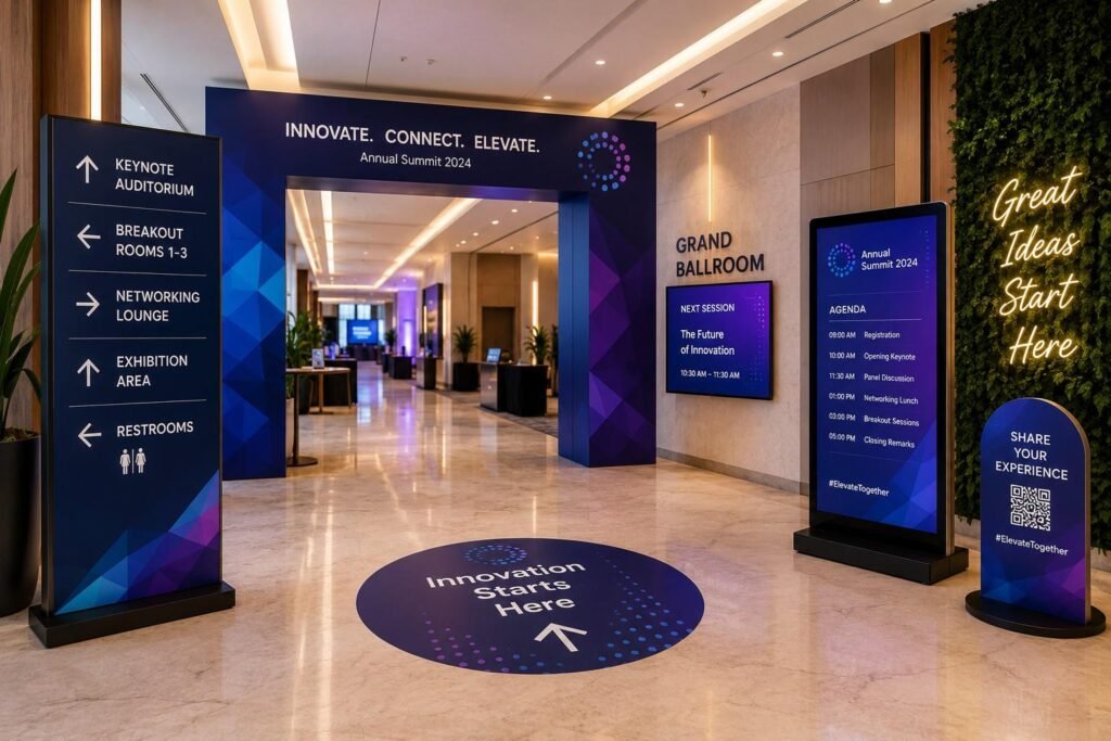
Navigation signs help attendees move between key areas. These can include directional boards, arrows, floor markers and signs identifying entrances, exits, conference rooms or breakout areas. Their priority is clarity. Attendees should be able to understand the destination and direction quickly, particularly in busy corridors or large venues.


Information Signage

Information signage provides details attendees may need during the event. This could include schedules, session information, venue maps, registration instructions or event policies. The information should be organised according to importance rather than placed together simply because there is space available. A crowded sign can be as unhelpful as having no sign at all.


Branding Signage

Branding signage helps establish the visual identity of the event. Entrance displays, registration counters, stage backdrops, branded walls and sponsor areas can all contribute to the overall environment. Unlike directional signs, these elements can carry stronger visual treatments because their primary purpose is recognition and brand presence.


Experiential Signage

Some signs can do more than communicate information. Floor graphics, interactive displays, photo opportunities and creative installations can encourage attendees to engage with the environment. These elements are particularly useful when the event aims to create memorable brand interactions rather than simply provide information.


Digital Event Signage

Digital displays are useful when information changes throughout the programme. They can show session schedules, announcements, speaker information, live updates or dynamic directions. However, digital signage should complement rather than replace essential physical wayfinding. A fixed directional sign is still useful when an attendee needs to find a room quickly, especially if a screen is occupied with other content.


A well-planned corporate event signage system brings these categories together. Navigation, information, branding, experience and digital elements should feel like parts of the same environment rather than separate signage projects.

Where Should Corporate Event Signage Be Placed?

Even well-designed event wayfinding signage can fail if attendees see it too late. Placement should therefore be planned around movement and decision points, not simply around available walls, pillars or display areas. A useful principle is Predict → Direct → Confirm. Give attendees enough information before they need to make a decision, provide a clear direction at the decision point and then confirm that they are still on the correct route.


Before the Decision Point

Place the first directional cue far enough ahead of a junction, entrance or corridor split for attendees to read it without stopping suddenly. In a large conference venue, this could mean directing people towards breakout rooms before they reach the corridor where several rooms branch off. The exact distance depends on the venue, viewing conditions and expected crowd movement. The important point is that the sign should be visible while there is still time to act on the information.


At the Decision Point

The sign at the junction should make the choice obvious. Keep the destination names clear and use arrows consistently throughout the venue. If attendees need to choose between two halls, for example, the sign should distinguish the routes without forcing people to stop and interpret a complicated graphic.


After the Turn

A confirmation sign provides reassurance that attendees have taken the correct route. This is particularly useful in large venues where a corridor may continue for some distance after the initial turn. Consistent room names, colours or zone identifiers can make this confirmation easier. If a route begins with “Hall B” but later changes to “Conference Room 2,” the attendee may question whether they are still heading in the right direction.


Consider the Real Venue

Placement also needs to account for sightlines and physical obstructions. Columns, furniture, temporary structures, crowds and lighting can all affect visibility. A sign that is easy to see during an empty venue walkthrough may become difficult to spot once hundreds of attendees are moving through the space. For this reason, corporate event signage design should be reviewed alongside the venue layout, stage production, lighting and other event elements. The objective is not simply to place more signs, but to put the right information where attendees are most likely to need it.

How Many Signs Do You Need?

The number of signs depends on how the venue works, not simply on its size. Start with the attendee route. Look at the entrance, registration area, main event spaces, breakout rooms, networking areas and exits. Then identify the points where people need to choose a direction or may be unsure where to go. A straightforward venue may need only a few directional signs. A larger or more complicated venue may need additional signs at junctions and confirmation points. Before finalising the quantity, check:

  • Where do attendees need directions?
  • Where do routes split?
  • Which areas need room identification?
  • Are there places where a sign could be hidden by crowds, furniture or production?
  • Can digital screens handle any of the information?

The best way to check the final signage plan is to walk through the venue as an attendee would. If people can find their way without repeatedly stopping to ask for help, the signage is probably covering the important points.

Physical vs Digital Event Signage

Physical vs Digital Event Signage

Corporate events increasingly combine traditional signage with digital displays, but the choice should depend on what attendees need to know and how frequently that information changes. Physical and digital formats solve different problems, and a well-planned signage system often uses both. Corporate events increasingly combine traditional signage with digital displays, but the choice should depend on what attendees need to know and how frequently that information changes.


When Physical Signage Works Best

Physical signage is particularly effective for information that is unlikely to change during the event. Directional arrows, room names, entrance signs, floor markers and accessibility information can remain visible without depending on power, connectivity or screen availability.


Where Digital Signage Adds Value

Digital displays become more useful when information needs to change throughout the programme. Schedules, speaker details, session updates, announcements and live information can be updated without replacing printed materials.


Why a Hybrid Approach Often Works

For many large corporate events, physical and digital signage can complement each other. A fixed sign might direct an attendee towards a conference hall, while a nearby digital screen displays the day’s session schedule. If a session room changes, the digital display can communicate the update without requiring the entire physical wayfinding system to be redesigned. However, essential navigation should not depend entirely on a screen cycle.


Keep the Experience Consistent

Whether information appears on a printed board or digital display, it should belong to the same corporate event branding system. Consistent colours, typography, icons and terminology help attendees recognise information across different formats.


Designing Signage for Real Event Environments

A sign can look perfect on a design screen and still fail once it is placed inside a busy event venue. Event signage design needs to account for the conditions in which attendees will actually see and use it, including viewing distance, lighting, crowd movement and the surrounding production setup.


Design for the Viewing Distance

Typography and graphics should be easy to read from the point where attendees are expected to notice the sign. A message that looks clear when viewed up close may become difficult to read from the other side of a large lobby or corridor. Before finalising artwork, consider how far away attendees will be when they first encounter the sign. Essential information should have enough visual weight to remain readable without requiring people to stop and move closer.


Check Sightlines and Obstructions

Venue architecture can change how signage is seen. Columns, furniture, temporary structures, floral arrangements and crowds can block a sign that appeared completely visible during an empty-venue walkthrough. This is particularly important at registration areas, corridor intersections and entrances where attendee movement is highest. Sign placement should be reviewed from the actual approach direction rather than only from directly in front of the sign.


Consider Lighting and the Event Environment

Lighting can affect colour, contrast and readability. A sign that works under normal venue lighting may appear different under stage lighting, coloured LEDs or changing ambient conditions. Signage should therefore be considered alongside the wider event production plan. Stage design, LED screens, lighting, furniture and branding elements should create a connected environment rather than compete for attention.


Plan for Event-Day Conditions

The venue will not look the same once the event begins. Queues may form, furniture may move, exhibitors or sponsors may add displays, and hundreds of attendees may occupy spaces that were empty during setup. A final walkthrough should therefore test corporate event signage in realistic conditions. Check the approach to each important sign, confirm that the information is visible at the required distance and look for anything that could obstruct it.


Good signage is not simply well designed. It is designed for the environment in which people will actually use it.

Corporate Event Signage Checklist

Area

Check before the event

Venue & flow

Are the entrance, registration, main event area, breakout rooms, networking areas and exits easy to identify?

Wayfinding

Have the main routes and decision points been covered?

Directions

Can attendees understand where to go without stopping to ask staff?

Room names

Are room names and numbers consistent across all signage?

Visibility

Can each important sign be seen from the direction attendees will approach?

Obstructions

Could pillars, furniture, queues, staging or other event elements block any signs?

Readability

Is the important information easy to read without unnecessary copy or graphics?

Branding

Does the signage follow the event’s colours, fonts and visual identity without affecting clarity?

Digital signs

Is any changing information, such as schedules or session updates, accurate?

Sponsor branding

Are sponsor messages visible in the intended areas without interfering with navigation?

Accessibility

Is essential information clear and accessible for different attendees?

Event-day test

Has the complete attendee route been walked after staging, furniture and other production elements are in place?

Final check

Are there any signs that are missing, confusing, blocked, outdated or simply unnecessary?

How to Test Corporate Event Signage Before the Event

Signage should be tested in the actual venue before the event begins. A design approval can confirm that the artwork looks right, but it cannot show whether an attendee will notice a sign from the correct distance, understand an arrow quickly or see the sign once the venue is busy. A practical corporate event signage walkthrough should follow the same route an attendee is expected to take.


Start With Visibility

Walk towards each important sign from the direction attendees will approach it. Check whether it is visible early enough and whether anything blocks it. A sign placed behind a pillar or hidden by a registration queue may technically be in the right location but still fail its purpose.


Check Readability

Stand at the expected viewing distance and read the sign without moving closer. Check the size of the main message, contrast, typography and supporting information. If an attendee has to stop, squint or walk closer to understand a basic direction, the sign needs to be reconsidered.


Follow the Direction

Test every route from beginning to end. Follow the arrows exactly as an attendee would and check whether the next sign appears naturally. This is where gaps in event wayfinding signage often become apparent. One sign may point towards a destination correctly, but the attendee may have no confirmation after turning a corner or entering another corridor.


Test Real Event Conditions

Where possible, review signage after furniture, staging, lighting and other event infrastructure has been installed. Also consider how queues and crowds could affect visibility. A sign that works perfectly in an empty venue may become difficult to see once attendees fill the space.


Check Consistency

Review room names, arrows, colours, icons and terminology across the entire signage system. Small inconsistencies can create confusion, especially at large events with multiple halls or breakout areas. The final walkthrough should also confirm that digital displays, printed signage and other branded elements follow the same visual system. Testing is therefore not simply a final quality check. It is an opportunity to experience the signage from the attendee’s perspective and correct problems before they affect the live event.

How to Measure the Effectiveness of Event Signage

The success of event signage should not be judged only by how attractive it looks in photographs. Its real value can be seen in how well it helps attendees navigate the venue, access information and interact with the event environment.


Look at Navigation Efficiency

One practical indicator is how often attendees need help finding basic locations. If staff repeatedly receive questions about registration, breakout rooms, restrooms or session halls, the wayfinding system may need improvement. Observing where people stop, turn back or gather around information desks can also reveal navigation problems that may not be obvious during planning.


Measure Engagement Where Relevant

Some signage is designed to encourage interaction rather than simply provide directions. Branded displays, QR codes, product information points and interactive installations can be evaluated through appropriate engagement measures. For example, QR scans or visits to a promoted area can indicate whether an experiential sign successfully attracted attention.


Gather Attendee Feedback

Post-event surveys can provide useful insight into whether attendees found the venue easy to navigate. A simple question about the clarity of event directions can reveal whether the signage system supported the overall experience. Feedback should be considered alongside observations from the event team rather than treated as the only measure.


Consider Brand Visibility

For corporate event branding, signage can also contribute to visibility across key areas of the venue. This can be reviewed through event photography, branded touchpoint coverage, attendee-generated content and sponsor feedback where relevant. The objective is not to measure every sign individually. Instead, look at whether the overall signage system helped people move through the venue, find information and experience the brand consistently. When these measures are considered together, event signage becomes easier to evaluate as part of the wider event experience rather than simply as a production cost.

Conclusion

Effective corporate event signage does more than tell attendees where to go. When it is planned around the attendee journey, each sign can serve a practical purpose while contributing to a consistent brand environment. The strongest approach is to begin with the venue layout and identify where attendees need information, then build a clear signage hierarchy around those decision points. From entrance branding and registration to wayfinding, session rooms and departure, the system should remain easy to understand and visually connected. For corporate events, the goal is not to use more signs. It is to use the right signage, in the right place, at the right moment. When branding, navigation and event production work together, signage becomes a useful part of the overall attendee experience rather than an afterthought.

FAQs

1. How early should corporate event signage be planned?

Signage planning should begin alongside the venue layout and event production plan, not immediately before artwork goes into production. Mapping the attendee journey early helps identify the number and type of signs required, installation locations, sightlines, branding requirements and any venue restrictions. This also leaves time for a physical walkthrough and changes before installation.

The number of signs should be based on attendee movement rather than the size of the venue. Start by identifying every major destination and decision point, then determine where an attendee needs to receive, follow or confirm a direction. A large venue does not necessarily need more signs everywhere; it needs signs where information is most useful.

Yes, but visual consistency does not mean every element needs to look identical. Corporate event signage design should share key elements such as typography, colours, graphic language and terminology with the wider event environment. Functional signs should remain easy to read, while high-visibility areas such as entrances and stage surroundings can carry stronger branding.

Large venues require particular attention to sightlines, multiple routes, floor levels, room naming and attendee flow. Signage should be visible before major decision points and should provide confirmation after important turns. A consistent naming and colour-coding system can also help attendees understand different zones without having to repeatedly stop and ask for directions.

Not necessarily. Digital signage is more useful when information changes frequently, such as session schedules, speaker updates and live announcements. Printed signage is often more dependable for fixed directions, room names, entrances and exits. A combination of both usually provides greater flexibility without making essential navigation dependent on screens or connectivity.

Sponsor branding should be integrated according to the purpose and location of each sign. High-traffic areas, branded installations and designated sponsor zones can provide strong visibility, while essential directional signage should keep navigation as its primary function. Clear separation between information, wayfinding and promotional messaging prevents sponsorship from making the venue harder to navigate.

Accessibility should be considered during the design stage rather than added after production. Use sufficient contrast, readable typography, clear symbols and straightforward language, and make sure essential information is positioned where it can be seen easily. Accessibility requirements should also be reviewed against the venue and event audience rather than relying on a single design rule.

The final walkthrough should follow the attendee journey rather than simply checking whether every sign has been installed. Look for blocked sightlines, incorrect directions, inconsistent room names, poor visibility, confusing arrows and signs that become difficult to see once furniture, staging and crowds are present. Testing the route from an attendee’s perspective can reveal problems that are easy to miss during design approval.

Some signage elements can be reused when they contain flexible branding or information that does not depend on a specific date, venue or programme. Modular frames, branded structures and adaptable digital displays can have longer-term value. However, directional information and event-specific graphics should be reviewed for every new venue and attendee journey rather than reused automatically.