Why Booth Layout Has a Greater Impact on Visitor Engagement Than Booth Size
A larger exhibition booth does not automatically generate more visitors or better business results. Booth layout often has a far greater influence because it determines how easily people notice, enter, navigate, and interact with your space. A strategically designed 18-square-meter booth can outperform a poorly planned 72-square-meter booth if it creates a more intuitive and engaging visitor experience. This is one of the biggest misconceptions in the exhibition industry. Many exhibitors believe that securing a larger space or investing in expensive structural elements is the key to attracting more visitors. While booth size can improve visibility, layout determines whether that visibility translates into meaningful engagement and qualified leads.
Think of your exhibition stand as a physical customer journey. Every design element from the entrance and product displays to demonstration areas and meeting spaces either encourages visitors to move forward or gives them a reason to keep walking. A well-planned exhibition booth layout removes barriers, creates curiosity, and guides visitors naturally through the space. A poorly organised layout, regardless of its size, often creates confusion, increases cognitive load, and creates missed opportunities for interaction.
The First Few Seconds Decide Everything
One of the most important moments at any trade show happens before a visitor even enters your booth. As attendees walk through crowded exhibition aisles, they continuously scan their surroundings, filtering hundreds of visual messages in just a few seconds. This is often referred to as the 5-Second Rule, where visitors subconsciously decide whether a booth is worth their attention. Without consciously thinking about it, they ask themselves:
- What does this company do?
- Is this relevant to me?
- Can I enter easily?
- Is something interesting happening here?
- Is it worth stopping?
If your booth answers these questions quickly and clearly, visitors are more likely to pause and explore. If the space feels confusing, crowded, or difficult to access, they usually continue walking, not because they aren’t interested in your products, but because another booth appears easier to understand. This is why booth layout influences visitor engagement long before your sales team has an opportunity to start a conversation.
The Invisible Barriers That Reduce Booth Engagement
Many exhibition stands unintentionally discourage visitors without the exhibitor realising it. These obstacles are rarely physical walls; instead, they are subtle design choices that create hesitation.
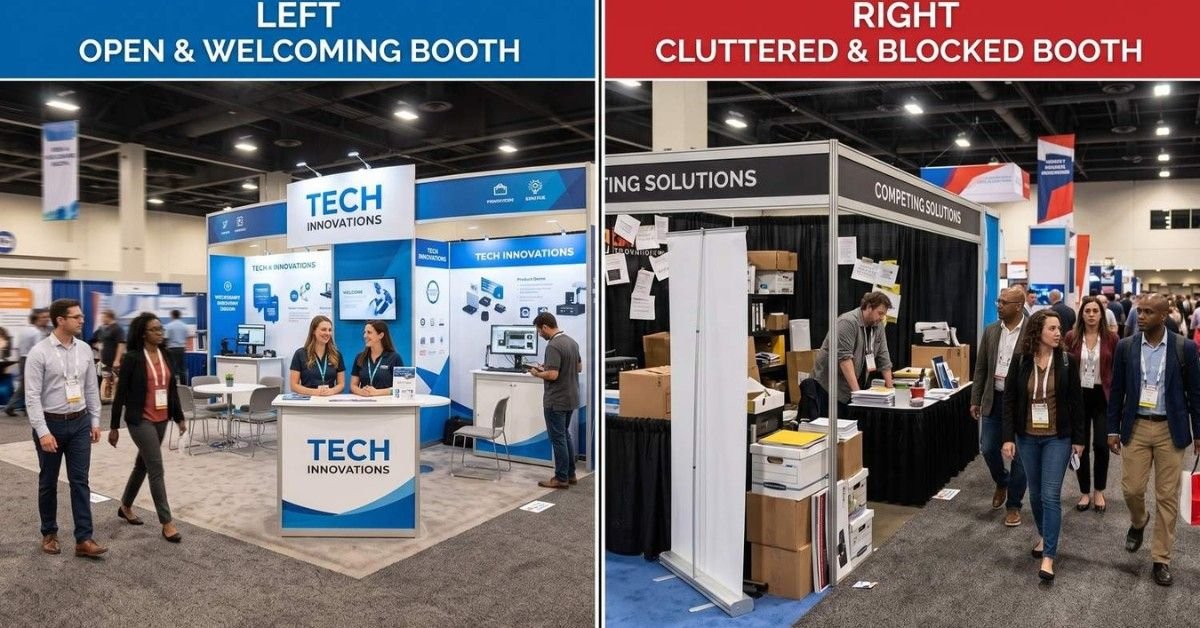
Narrow or Blocked Entrances: When the entrance is partially blocked by reception desks, furniture, storage units, or large product displays, visitors may feel they are entering a private space rather than a welcoming exhibition booth. Open and clearly visible entrances encourage spontaneous exploration.
Visual Clutter: Too many graphics, competing messages, promotional banners, screens, lighting effects, and product displays force visitors to process excessive information at once. Instead of attracting attention, clutter often overwhelms the brain, increases cognitive load, and makes decision-making more difficult.
No Clear Focal Point: Visitors naturally look for a starting point when approaching a booth. If every product, graphic, and display competes equally for attention, people struggle to understand where to focus first. A single, well-defined focal point immediately communicates what the booth is about and invites further exploration.
Poor Traffic Flow: Furniture placed in the wrong location, demonstration areas blocking walkways, or meeting tables positioned near entrances can interrupt natural visitor movement. Many exhibitors use heat map thinking during the planning stage to identify high-traffic areas and position hero products, demonstrations, or interactive experiences where they are most likely to capture attention. This improves exhibition visitor flow while allowing quieter zones to support detailed discussions. When visitors cannot move comfortably, they tend to leave quickly rather than navigate around obstacles.
Booth Layout Directly Influences Key Performance Metrics
A strategically designed trade show booth layout doesn’t just improve aesthetics it can positively impact measurable exhibition outcomes.
Performance Metric | How Booth Layout Makes a Difference |
Higher Visitor Entry Rate | Open layouts with clear sightlines encourage more attendees to step inside rather than simply walk past. |
Longer Dwell Time | Logical layouts and interactive experiences encourage visitors to spend more time exploring the booth. |
Better Lead Quality | Visitors who naturally progress through different engagement zones are often more informed before speaking with booth staff, resulting in more productive conversations. |
Improved Brand Recall | Memorable layouts create positive experiences that visitors remember long after the event, strengthening brand recognition. |
Stronger Exhibition ROI | Better visitor flow, higher engagement, and improved lead quality contribute to a stronger return on exhibition investment. |
Real-World Example
Imagine two companies exhibiting identical industrial automation products.
Company A invests heavily in a large booth with impressive structures, but the entrance is partially blocked by a reception counter, product displays are scattered throughout the space, and meeting tables occupy the front of the stand. Visitors hesitate, glance inside, and continue walking.
Company B occupies a smaller booth but creates a wide, welcoming entrance, places its flagship product in clear view, schedules live demonstrations near the aisle, and positions meeting areas toward the back. Visitors immediately understand what the company offers, enter comfortably, and naturally move deeper into the booth.
Despite having less floor space, Company B often generates more meaningful interactions because its layout supports the way visitors naturally explore exhibition environments. The lesson is clear: effective booth layout can outperform booth size when it is designed around visitor behaviour rather than simply maximising floor area.
Attention Is Earned Before Conversations Begin
Many exhibitors focus primarily on sales conversations, but those conversations only happen after visitors decide to stop at the booth. This makes attention one of the most valuable assets on the exhibition floor. Successful booth layouts are designed to capture that attention gradually rather than demanding an immediate commitment. By guiding visitors through a series of small, positive experiences such as clear visibility, welcoming entrances, engaging product displays, and interactive touchpoints booths naturally build curiosity and encourage deeper engagement. This step-by-step approach increases the likelihood that visitors will stay longer, start meaningful conversations, and eventually become qualified leads.
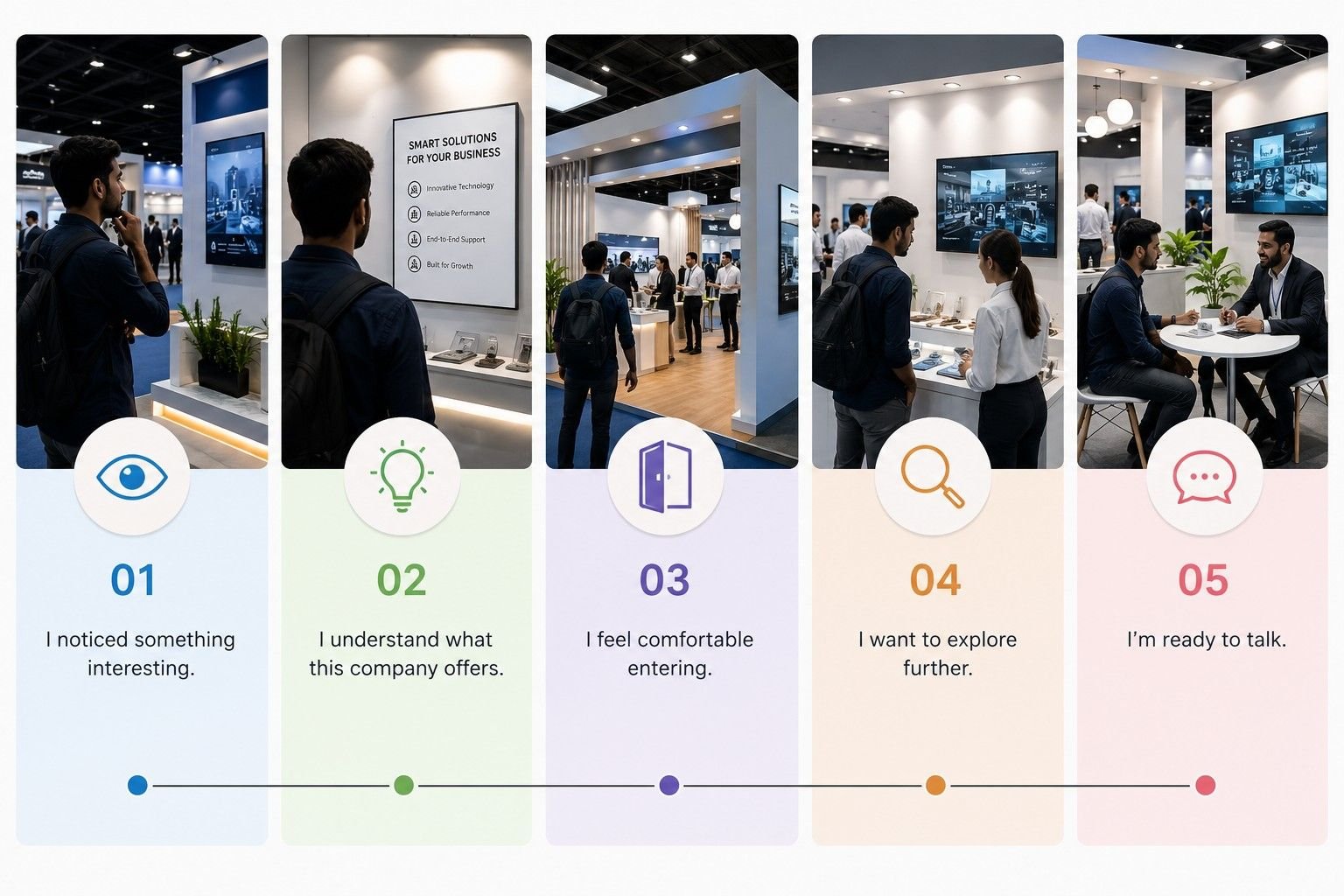
Each step reduces uncertainty and increases engagement.
Practical Design Strategies Based on Visitor Psychology
To encourage more visitors to stop and engage, consider these evidence-informed design practices:
- Position your most compelling product or innovation where it is visible from the main aisle.
- Use open corners and wide entrances to eliminate perceived barriers.
- Limit the number of competing marketing messages visible at one time.
- Create one dominant focal point supported by secondary information.
- Include movement within the booth through demonstrations or interactive experiences.
- Keep pathways intuitive and free from obstacles.
- Ensure staff remain approachable rather than forming closed groups near the entrance.
Small design improvements often have a significant impact because they influence the earliest stages of visitor decision-making.
The Visitor Psychology Funnel: A Step-by-Step Framework for Designing High-Engagement Exhibition Booths
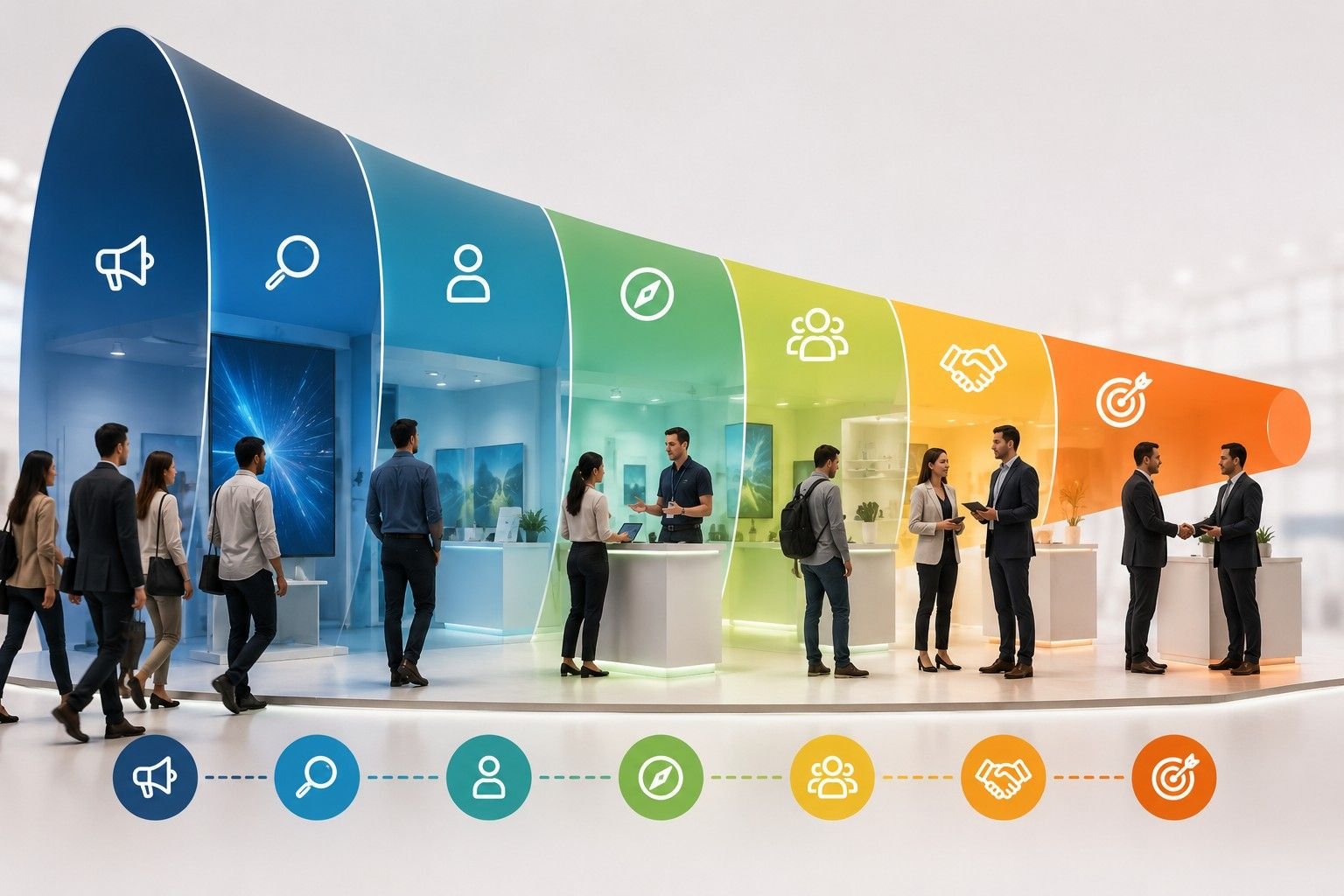
Every visitor follows a psychological journey before becoming a qualified lead. Understanding this journey helps exhibitors design booth layouts that guide attendees naturally from noticing the stand to having meaningful business conversations. This process is called the Visitor Psychology Funnel, a practical framework that aligns exhibition stand design with human decision-making. One of the biggest mistakes exhibitors make is assuming that every visitor who enters a booth is ready to talk to a sales representative.
In reality, engagement happens in stages. Visitors first become aware of your booth. They then decide whether it looks relevant, whether it feels easy to enter, whether it’s worth exploring, and finally whether they trust your company enough to start a conversation. If any one of these stages breaks down, the visitor often leaves before meaningful engagement occurs. Rather than viewing booth design as a collection of displays and furniture, successful exhibitors design every part of their stand to support the visitor’s psychological journey.
The Visitor Psychology Funnel
Unlike a traditional sales funnel, which begins after a prospect has already shown interest, the Visitor Psychology Funnel starts much earlier, often before a visitor even steps inside your booth. Every attendee follows a natural decision-making journey. They first notice your stand from a distance, decide whether it’s relevant, consider how easy it is to enter, explore what’s on display, and only then choose whether to start a conversation. Every stage influences the next, which is why successful exhibition booths are designed around the visitor experience rather than just the products being showcased. This approach closely aligns with customer journey mapping and human-centred design, where every interaction is planned to reduce friction, build confidence, and encourage meaningful engagement.
Stage 1: Awareness – Getting Noticed
The first challenge is simply getting visitors to notice your booth. In a busy exhibition hall filled with competing brands, attendees make split-second decisions about where to focus their attention. Strong branding, strategic lighting, visible products, and live demonstrations all help attract attention. At this stage, your objective isn’t to explain everything; it’s to communicate enough for visitors to understand who you are and give them a reason to slow down.
Stage 2: Curiosity – Encouraging Visitors to Stop
Capturing attention is only the beginning. The next step is giving visitors a reason to stop instead of continuing down the aisle. People are naturally drawn to experiences that spark curiosity. A product in action, an interactive display, an innovation launch, or even a simple question displayed on signage can encourage attendees to take a closer look. The key is to create interest without creating confusion. Visitors should immediately understand what your company offers while feeling encouraged to learn more.
Stage 3: Comfort – Making Entry Feel Effortless
Even interested visitors may hesitate if a booth feels difficult to enter. Open entrances, clear sightlines, wide walkways, comfortable lighting, and approachable staff all help create an environment that feels welcoming. When people can easily understand where to walk and what to expect, entering the booth becomes a natural decision rather than one that requires extra thought. Sometimes, standing outside your booth during setup and viewing it from a visitor’s perspective is the easiest way to identify barriers that might otherwise go unnoticed.
Stage 4: Exploration – Guiding the Visitor Journey
Once inside the booth, visitors begin looking for information that helps them decide whether your products or services match their needs. This is where a well-planned layout becomes important. Clearly defined areas for product displays, live demonstrations, interactive experiences, consultations, and meetings help visitors move through the booth naturally. Rather than overwhelming attendees with information all at once, each area should reveal something new and gradually build interest. A logical flow not only improves the visitor experience but also encourages people to spend more time exploring the booth.
Stage 5: Engagement – Starting Meaningful Conversations
Not every visitor is ready to speak with your team the moment they enter. Many attendees prefer to observe a demonstration, interact with a product, or browse displays before starting a conversation. Giving visitors this space often results in more meaningful interactions because they approach your team with genuine questions rather than feeling interrupted. The role of booth staff is to recognise these moments and engage naturally, offering assistance when visitors show clear interest rather than immediately beginning a sales pitch.
Stage 6: Trust – Building Confidence
Meaningful engagement only turns into business opportunities when visitors trust your company. Professional booth design, knowledgeable staff, live demonstrations, customer success stories, case studies, testimonials, certifications, and completed projects all reinforce credibility. Every interaction should reassure visitors that your business has the experience and expertise to solve their challenges. The more confident visitors feel in your capabilities, the more likely they are to continue the conversation after the exhibition.
Stage 7: Conversion – Creating the Next Opportunity
The final stage isn’t necessarily making a sale on the exhibition floor. More often, it’s creating the next meaningful step in the relationship. That could be scheduling a product demonstration, arranging a follow-up meeting, requesting a quotation, downloading technical information, or exchanging contact details. A well-designed booth supports these conversations by providing comfortable meeting spaces that are separate from the busiest areas of the stand. When every stage of this visitor journey is thoughtfully planned, exhibitors create an experience that feels natural rather than forced. Visitors move from awareness to engagement with confidence, making it far more likely that a brief interaction at a trade show develops into a long-term business relationship.
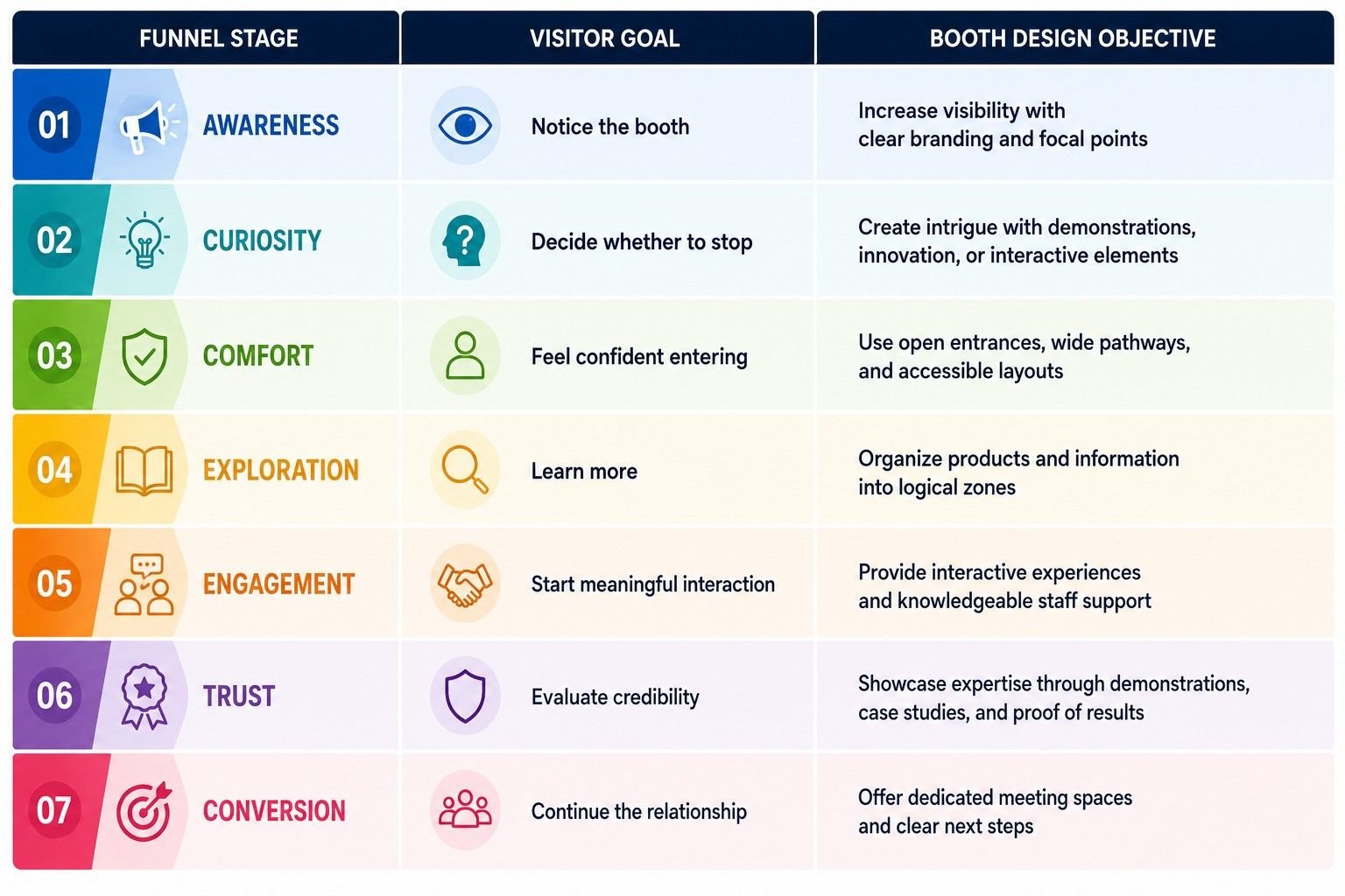
Applying the Visitor Psychology Funnel to Booth Design
Every design decision should support one or more stages of the funnel.
Common Mistakes That Break the Funnel
Even visually impressive booths can lose visitors if one stage of the journey is interrupted.
Some common issues include:
- Strong products hidden from the aisle.
- Crowded entrances that discourage entry.
- Attractive branding but no reason to stop.
- Confusing layouts with no logical flow.
- Sales staff approach visitors too aggressively.
- Meeting areas occupying valuable engagement space.
- No clear call-to-action before visitors leave.
Optimising just one weak stage can significantly improve overall booth performance.
The Essential Booth Layout Principles That Improve Visitor Flow and Engagement
An effective exhibition booth layout is more than an attractive arrangement of displays and furniture. It is a strategic environment designed to guide visitor movement, encourage interaction, reduce friction, and support meaningful business conversations. Every element should contribute to a smooth visitor journey from first impression to lead generation. Once you understand how visitors think and move, the next challenge is designing a booth that supports those natural behaviors.
This is where many exhibitors lose opportunities. They invest in premium graphics, advanced technology, and eye-catching structures, but overlook the way these elements work together. A booth may look impressive from a distance yet become confusing, uncomfortable, or difficult to navigate once visitors step inside. High-performing exhibition stand designs follow a set of practical layout principles that make it easier for visitors to explore, engage, and remember the brand. These principles are based on human behaviour rather than temporary design trends, making them effective across industries and booth sizes.
Principle 1: Create an Open and Inviting Entrance
The entrance is the first physical interaction visitors have with your booth, and it often determines whether they decide to step inside or keep walking. Even if your products are relevant, a narrow entry, tall display units, or a reception counter placed at the front can unintentionally make the booth feel closed. An open entrance gives visitors confidence to explore at their own pace, making the space feel approachable rather than intimidating.
A welcoming entrance should:
- Be clearly visible from the main aisle.
- Provide enough space for multiple visitors to enter comfortably.
- Avoid physical barriers such as large furniture or display walls.
- Give visitors a clear view of what they can experience inside the booth.
Best Practice: Position reception desks and information counters slightly inside the booth instead of directly at the entrance. This creates a more inviting first impression and encourages visitors to step inside before beginning a conversation.
Principle 2: Establish a Strong Visual Focal Point
When visitors glance at your booth, they should immediately know where to look first. Without a clear focal point, every graphic, product, and screen competes for attention, making the booth feel cluttered. A single dominant feature helps communicate your brand message within seconds while encouraging visitors to explore further. Once their attention is captured, they’re much more likely to engage with the rest of the space.
Your focal point could be:
- A flagship product or new launch.
- A live product demonstration.
- A large LED or digital display.
- An interactive experience.
- A distinctive architectural feature or hanging sign.
Best Practice: Ask yourself, “If someone only looked at our booth for five seconds, what is the one thing we want them to remember?” Build your layout around that answer.
Principle 3: Design Clear Visitor Pathways
A well-designed booth should guide visitors naturally without requiring signs or verbal instructions. People should instinctively know where to enter, which displays to explore first, and where conversations or demonstrations are taking place. When pathways are too narrow or cluttered, visitors often leave before exploring the entire booth. Clear circulation creates a smoother visitor journey and allows multiple people to move comfortably through the space, even during busy hours.
An effective layout should allow visitors to:
- Enter the booth without hesitation.
- Move naturally between displays and demonstrations.
- Explore products in a logical sequence.
- Reach meeting areas without disrupting visitor flow.
Best Practice: Think of your booth as a story. Every pathway should naturally guide visitors from one experience to the next without causing confusion or unnecessary backtracking.
Principle 4: Divide the Booth into Functional Zones
A well-designed exhibition booth shouldn’t feel like one large open space where everything competes for attention. Instead, divide the booth into dedicated zones based on the different activities visitors are likely to experience. This makes the space easier to navigate while helping attendees absorb information gradually rather than all at once. As visitors move through each zone, they naturally progress from discovering your brand to having more meaningful conversations with your team.
Common functional zones include:
- Welcome Zone to attract visitors and introduce your brand.
- Product Discovery Zone to showcase key products or solutions.
- Demonstration Zone for live presentations or interactive experiences.
- Consultation Zone for technical discussions and product enquiries.
- Meeting Zone for private business conversations.
Best Practice: While each zone should have a distinct purpose, the overall layout should feel connected. Visitors should naturally move from one area to the next without feeling like they’re entering separate spaces.
Principle 5: Use Visual Hierarchy to Simplify Decision-Making
Visitors shouldn’t have to search for the most important information when they enter your booth. A clear visual hierarchy helps them process information quickly by directing their attention in the right order. Instead of presenting every message with equal importance, organise your content so visitors first notice your brand, then your key offering, and finally the supporting product details. This reduces cognitive load and makes it easier for people to understand what your business offers within a few seconds.
A strong visual hierarchy is created through:
- Different sizes for headlines and supporting text.
- Strategic lighting to highlight key areas.
- Contrasting colours to draw attention.
- Clear positioning of products and displays.
- Simple, easy-to-read typography.
Best Practice: Follow the principle of “less but better.” Highlight one primary message first, then guide visitors towards supporting information instead of trying to communicate everything at once.
Principle 6: Balance Openness with Privacy
An inviting booth should feel open enough to encourage visitors inside while also providing quieter spaces for meaningful business conversations. If everything happens in one open area, discussions can easily be interrupted by noise and foot traffic. On the other hand, too many enclosed spaces can make the booth appear unwelcoming. Finding the right balance allows exhibitors to engage casual visitors while creating a comfortable environment for serious buyers who are ready to discuss business.
A balanced booth layout should include:
- Open areas that attract visitors from the aisle.
- Demonstration spaces that remain visible to passers-by.
- Semi-private consultation areas for product discussions.
- Dedicated meeting spaces away from heavy foot traffic.
Best Practice: Position meeting tables towards the rear or sides of the booth rather than next to the aisle. This gives conversations more privacy without making the booth feel closed or inaccessible.
Principle 7: Design for Natural Human Behaviour
Visitors rarely move through an exhibition booth in a perfectly planned sequence. They stop when something catches their attention, change direction to explore a product, watch a demonstration, or return to an area they found interesting earlier. Rather than trying to control every movement, your booth should support these natural behaviours. A flexible layout allows visitors to explore at their own pace while making it easy for groups to gather without blocking the flow of traffic.
When planning your layout, consider:
- Where visitors are most likely to pause.
- Spaces where small groups can gather comfortably.
- Viewing distances for demonstrations or digital displays.
- Easy access to products and interactive experiences.
- Flexible pathways that don’t force a single route.
Best Practice: Observe visitor movement during the first few hours of the event. If people consistently avoid certain areas or create bottlenecks, small adjustments can often improve the overall visitor flow for the rest of the exhibition.
Principle 8: Encourage Longer Dwell Time
The longer visitors spend inside your booth, the more opportunities you have to educate them, answer questions, demonstrate products, and build relationships. However, people won’t stay simply because you’ve given them somewhere to stand. They stay when every part of the booth offers something valuable to discover. Interactive experiences, engaging demonstrations, and a comfortable environment encourage visitors to explore naturally instead of leaving after a quick glance.
Elements that can increase dwell time include:
- Interactive product experiences.
- Live demonstrations throughout the day.
- Hands-on product exploration.
- Comfortable seating for longer discussions.
- Educational presentations or digital content.
- Clear navigation between different activity zones.
Best Practice: Give visitors a reason to move beyond the entrance. Placing engaging experiences deeper inside the booth encourages exploration and naturally increases the time they spend with your brand.
Principle 9: Make Every Square Metre Purposeful
Exhibition space is one of the biggest investments an exhibitor makes, so every square metre should contribute to a clear business objective. Instead of filling empty areas with decorative elements, consider how each feature supports the visitor experience. Whether it’s attracting attention, showcasing products, encouraging interaction, or facilitating conversations, every part of the booth should have a defined purpose.
As you review your layout, ask yourself:
- Does this feature attract or engage visitors?
- Does it improve visitor movement?
- Does it encourage interaction with our products?
- Does it support conversations with the sales team?
- Does it strengthen our brand message?
Best Practice: If a display, piece of furniture, or decorative feature doesn’t support a visitor or business objective, consider removing it. Simpler, purpose-driven layouts often perform better than overcrowded ones.
Principle 10: End the Visitor Journey with a Clear Next Step
A successful booth experience shouldn’t end when visitors leave your stand. Every interaction should lead naturally to the next stage of the relationship, whether that’s a follow-up meeting, product demonstration, quotation request, or continued conversation after the event. Making these next steps clear ensures that the interest you’ve generated on the exhibition floor doesn’t disappear once the show ends.
Depending on your objectives, the next step could include:
- Scheduling a product demonstration.
- Booking a follow-up meeting.
- Requesting a quotation.
- Downloading product information or technical resources.
- Registering for a webinar or presentation.
- Exchanging contact details with your sales team.
Best Practice: Make your call to action simple and easy to act on. Whether it’s scanning a QR code, booking a meeting, or speaking to a team member, visitors should know exactly what to do before they leave the booth.
How Different Booth Layouts Influence Visitor Movement and Engagement
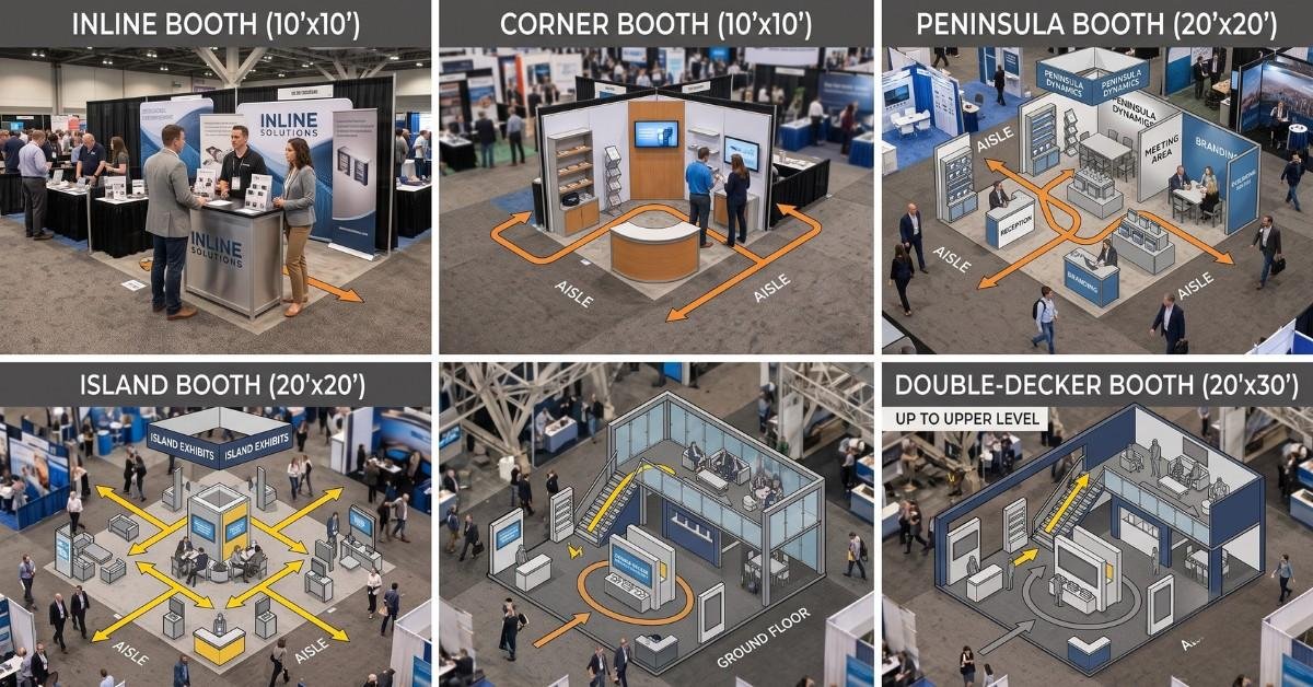
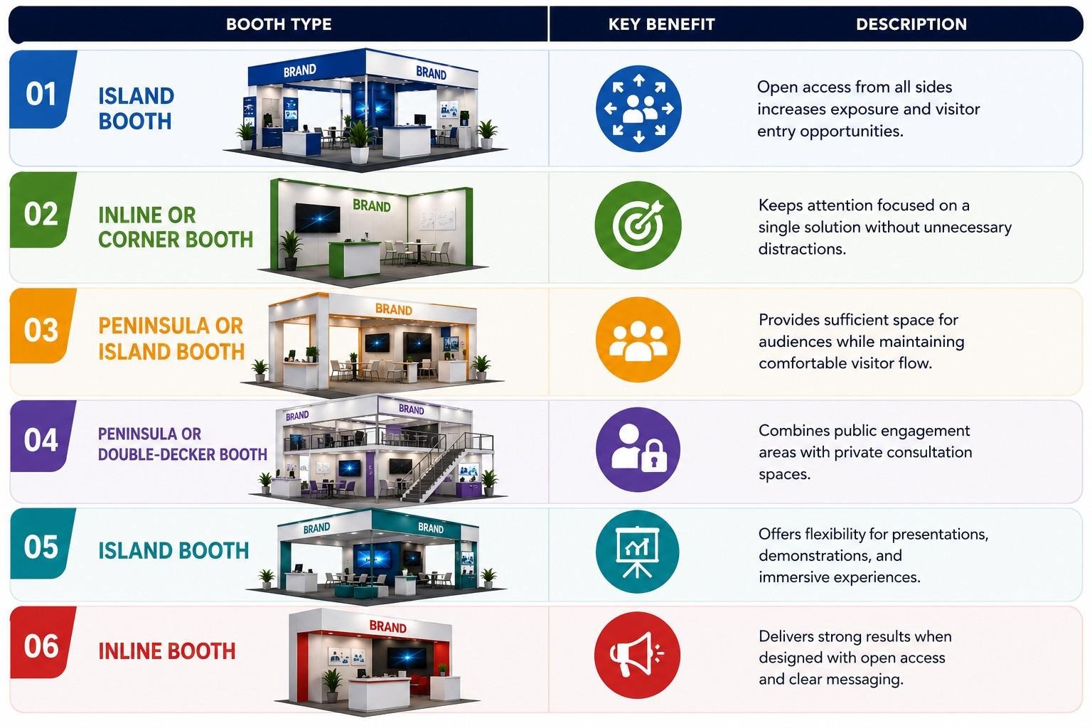
Not every exhibition booth layout performs the same way. The size, shape, location, and openness of a booth directly influence how visitors approach, navigate, and interact with the space. Understanding the strengths and limitations of different booth configurations helps exhibitors choose a layout that supports their objectives, target audience, and exhibition strategy. Selecting the right booth type is often treated as a logistical decision based on available floor space or budget. However, from a visitor psychology perspective, the booth configuration itself shapes the entire customer experience. A booth with multiple open sides naturally attracts visitors differently than a booth with a single entrance. Likewise, a product demonstration that works well in an island booth may be less effective in a compact inline stand. Rather than asking, “Which booth is the biggest?”, exhibitors should ask, “Which booth layout best supports how visitors will discover, explore, and engage with our brand?”
1. Inline Booths: Maximizing Engagement in Compact Spaces
An inline booth is positioned in a straight row alongside other exhibitors and is typically open on only one side. Although it offers fewer entry points than larger booth types, an inline stand can still generate strong visitor engagement when designed strategically.
Visitor Behavior: Visitors approach from the front and make quick decisions based on what they can see from the aisle. If the booth appears crowded or visually overwhelming, they are likely to continue walking.
Design Strategy:
To maximise engagement:
- Keep the entrance completely open.
- Position your flagship product where it is visible from the aisle.
- Use vertical branding to increase visibility from a distance.
- Minimise furniture near the entrance.
- Arrange displays in a clear left-to-right or centre-focused sequence.
Common Mistake: Many exhibitors place reception counters directly at the front of inline booths, unintentionally creating a barrier that discourages visitors from entering.
Best For: An open and focused booth layout is ideal for startups, small and medium-sized businesses, product launches, budget-conscious exhibitors, and brands promoting one primary product or solution. It helps create a strong first impression while keeping the visitor journey simple and easy to navigate.
2. Corner Booths: Increasing Visibility from Multiple Directions
A corner booth has two open sides, allowing visitors to approach from different aisles. This additional visibility often results in higher foot traffic compared to an inline booth.
Visitor Behaviour: Visitors tend to enter from whichever side offers the clearest visual invitation. They also spend more time observing the booth before deciding where to enter.
Design Strategy:
- Create welcoming entrances on both open sides.
- Position your focal display where it can be seen from multiple angles.
- Use corner visibility to showcase demonstrations.
- Ensure branding remains consistent regardless of viewing direction
Common Mistake: Treating one side as the “front” while neglecting the second open side often reduces engagement opportunities.
Best For: This layout is well suited for mid-sized exhibitors, technology companies, industrial product demonstrations, and businesses expecting moderate visitor traffic. It provides enough space to showcase products effectively while supporting smooth visitor flow and creating opportunities for meaningful interactions.
3. Peninsula Booths: Guiding Visitors Through Structured Experiences
A peninsula booth is open on three sides and typically shares one wall with another exhibitor. Its larger footprint allows exhibitors to create a more structured visitor journey.
Visitor Behaviour: Visitors approach from several directions and often enter through the side that appears most accessible. Once inside, they expect a logical flow that helps them understand the company’s products and services.
Design Strategy:
Divide the booth into clearly defined zones such as:
- Welcome area
- Innovation showcase
- Product demonstration zone
- Interactive experience
- Consultation area
- Meeting rooms
This layout supports both casual exploration and deeper business discussions.
Common Mistake: Overloading the open sides with graphics or displays, making it difficult for visitors to identify the primary entrance.
Best For: This layout is ideal for manufacturing companies, B2B solution providers, engineering firms, automation companies, and healthcare technology brands that need dedicated spaces for product demonstrations, technical discussions, and detailed business conversations while maintaining a well-organised visitor experience.
4. Island Booths: Creating Immersive Brand Experiences
An island booth is open on all four sides, making it one of the most accessible and visually prominent exhibition formats. Because visitors can enter from any direction, the booth must be designed without relying on a single “front.”
Visitor Behaviour: Attendees naturally circulate the booth before choosing an entry point. They expect freedom to explore rather than follow a predetermined route. This makes visitor flow significantly more dynamic than in smaller booth configurations.
Design Strategy:
To optimise movement:
- Keep all entrances open.
- Place key attractions near major traffic routes.
- Use suspended signage for visibility.
- Position demonstrations where they can be viewed from multiple angles.
- Create central engagement zones connected by wide circulation paths.
Common Mistake: Concentrating all activity in the centre of the booth while leaving the perimeter underutilised. Visitors should encounter opportunities for engagement before reaching the middle of the stand.
Best For: This layout is best suited for global brands, product launches, automotive exhibitors, industrial machinery manufacturers, consumer electronics companies, and businesses exhibiting at international trade shows. It is designed to create a strong visual impact, accommodate high visitor volumes, and support large-scale product showcases and immersive brand experiences.
5. Double-Decker Booths: Separating Public Engagement from Private Business
Double-decker exhibition stands combine open public spaces with elevated private meeting areas. This layout works particularly well for exhibitors expecting high visitor volumes and confidential business discussions.
Visitor Behaviour: Visitors are naturally attracted to the scale and architectural presence of multi-level booths. However, they generally remain on the ground floor unless invited upstairs.
Design Strategy:
Use the lower level for:
- Product displays
- Live demonstrations
- Interactive experiences
- Brand storytelling
Reserve the upper level for:
- Client meetings
- VIP hospitality
- Contract negotiations
- Executive discussions
This separation allows exhibitors to engage both casual visitors and serious buyers without disrupting either experience.
Common Mistake: Allowing the upper level to dominate the booth visually while neglecting engagement opportunities on the ground floor.
6. Custom Booths: Designing Around Visitor Objectives Rather Than Booth Type
The highest-performing exhibitors rarely design around booth size alone.
Instead, they begin by asking:
- What do we want visitors to experience?
- Where should they stop?
- Which products deserve the most attention?
- Where will demonstrations happen?
- When should conversations begin?
- How will visitors leave the booth?
Once these questions are answered, the booth layout is developed to support those objectives. This visitor-first approach often delivers better results than simply choosing the largest or most elaborate stand.
Choosing the Right Booth Layout Based on Your Objectives
The ideal booth configuration depends on what you want to achieve during the exhibition.
How Visual Hierarchy, Colour Psychology, and Lighting Influence Visitor Decisions
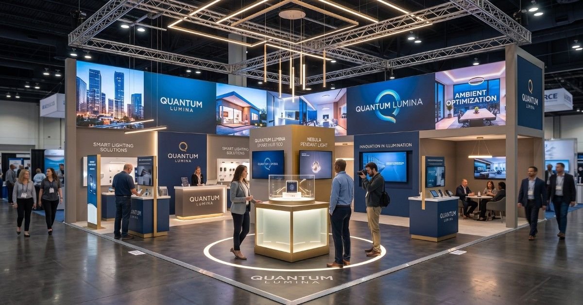
Your exhibition booth has only a few seconds to capture attention. Before visitors read your messaging or speak with your team, they instinctively notice the booth’s layout, colours, lighting, and visual organisation. These design elements shape their first impression and influence whether they decide to stop or keep walking. A well-designed exhibition stand doesn’t try to display everything at once. Instead, it guides visitors’ attention naturally, making information easy to understand and the booth inviting to explore.
Visual Hierarchy Helps Visitors Process Information Faster
Visual hierarchy is the art of presenting information in the order visitors are most likely to consume it. Rather than giving every graphic and product equal importance, a well-designed booth directs attention from one element to the next. In most cases, visitors should immediately recognise your brand, understand what your company offers, and then notice the product or experience you want to highlight. Once these questions are answered, they are far more likely to continue exploring the booth instead of feeling overwhelmed by too much information.
A simple way to organise this journey is:
Visitors Notice First | Then They Look For | Finally They Explore |
Brand identity | Core value proposition | Products, demonstrations, and supporting information |
This approach reduces cognitive load and allows visitors to absorb information naturally instead of trying to process everything at once.
Colour Should Guide Attention, Not Compete for It
Colour is one of the first things visitors notice, but its role goes beyond making a booth look attractive. Used strategically, colour can draw attention to important products, reinforce brand identity, and make navigation easier. When every display uses bold colours or high contrast, however, nothing truly stands out. The most effective exhibition booths usually rely on a consistent colour palette, using accent colours only where they want visitors to focus. Neutral backgrounds also help products, demonstrations, and brand messaging become more prominent without creating unnecessary visual clutter. Rather than asking, “Which colours look impressive?”, it’s often more useful to ask, “Where do we want visitors to look first?”
Lighting Shapes the Visitor Experience
Lighting is often treated as a finishing touch, but it plays a much bigger role in influencing visitor behaviour. Well-planned lighting creates depth, highlights key products, and subtly guides people through the booth. It can also change how visitors perceive the quality and professionalism of your brand. Different areas of the booth usually require different lighting approaches. General lighting makes the space feel open and comfortable, focused lighting highlights hero products or demonstrations, while softer lighting can create a more relaxed atmosphere for business discussions. When used thoughtfully, lighting helps create a natural visual journey without visitors consciously noticing it.
White Space Is Just as Important as What You Display
Many exhibitors believe that every available surface should be filled with graphics, products, or promotional messaging. In reality, giving important elements room to breathe often makes them far more noticeable. White space doesn’t mean wasted space. It helps separate information, improves readability, and allows visitors to focus on one message at a time. A clean, organised booth often appears more premium than one packed with visuals competing for attention. Sometimes, removing a display can improve the visitor experience more than adding another one.
Create an Experience, Not Just a Display
People rarely remember every product they saw during a trade show, but they often remember how a booth made them feel. This is why the most successful exhibitors focus on creating experiences rather than simply displaying products. Whether it’s a live demonstration, an interactive touchscreen, a hands-on product trial, or a comfortable space for conversation, these moments encourage visitors to spend more time inside the booth and create stronger memories of the brand. Every interaction becomes another opportunity to build trust and move visitors closer to meaningful business conversations. Ultimately, visual hierarchy, colour, lighting, and interactive experiences work together to create a booth that feels intuitive, engaging, and easy to explore. When these elements are carefully planned, visitors don’t just notice your booth; they’re naturally encouraged to step inside and stay longer.
Conclusion
A successful exhibition booth is more than an attractive display; it’s a carefully planned experience that guides visitors from curiosity to meaningful engagement. By applying the principles of visitor psychology, strategic booth layout, clear visual hierarchy, and effective traffic flow, exhibitors can create spaces that increase visitor engagement, generate qualified leads, and improve exhibition ROI.
Whether you’re exhibiting at a regional trade show or an international expo, designing your booth around how people naturally think and move will always deliver better results than focusing on aesthetics alone. The best exhibition stands don’t just attract visitors they create experiences that leave a lasting impression and drive real business opportunities.