Healthcare Exhibition Booth Design: How to Balance Open Displays With Private Consultation Areas

Healthcare Exhibition Booth Design: How to Balance Open Displays With Private Consultation Areas

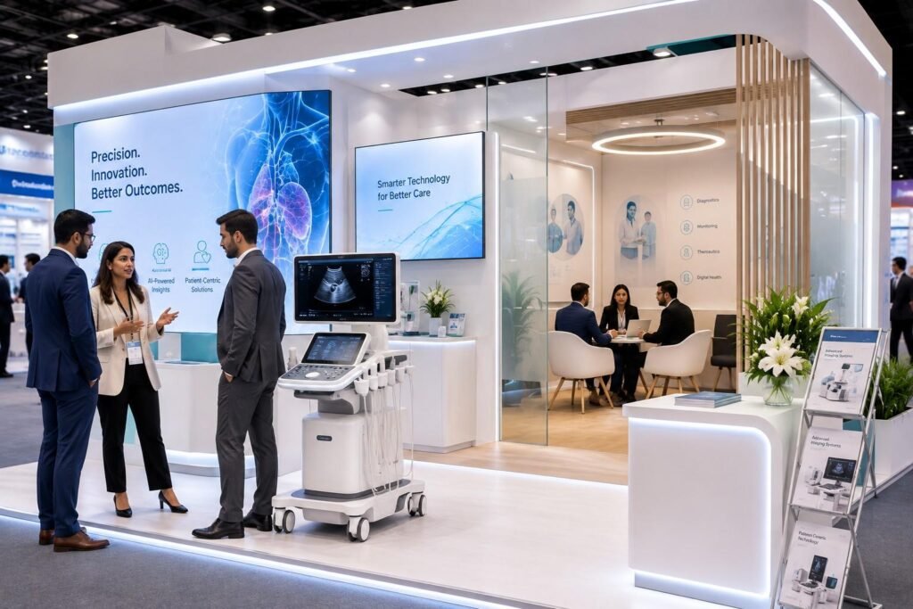
A healthcare exhibition booth has to do two things that can easily work against each other: invite people in while giving some conversations enough privacy to happen comfortably. An open layout makes products, demonstrations and brand messaging easy to see from the aisle. But healthcare exhibitions often involve more than quick product introductions. Conversations can move into technical details, procurement, pricing, distributor discussions or other matters that visitors may not want to discuss in full view of the exhibition floor. The answer is not to simply add a closed meeting room. A better approach is to plan the booth around different levels of access: open areas for discovery, semi-private spaces for focused conversations, and fully private rooms when the discussion genuinely requires them. The challenge in healthcare exhibition booth design is deciding where each level belongs without blocking product visibility, creating bottlenecks or making the stand feel closed. The right balance depends on the booth footprint, visitor flow, type of product, expected meeting volume and the kind of conversations the team needs to have.
Exhibition Booth Design

What Is a Healthcare Exhibition Booth?

A healthcare exhibition booth is a branded space at a trade show or medical event where a company presents its products, technology or services and interacts with potential customers, healthcare professionals, distributors and other industry visitors. Unlike a general-purpose exhibition stand, a healthcare booth often has to support several types of interaction within the same footprint. A medical-device company may need room for a working product demonstration, while its sales team may need a quieter place to discuss specifications or commercial terms with a hospital buyer. A healthcare technology company might need an open area for a software demonstration alongside a more comfortable setting for a detailed business conversation. That makes the layout more than a branding exercise. The booth has to support what visitors are actually there to do. A well-planned healthcare exhibition booth typically brings together several functional areas, such as:


  • Product display: makes key products or solutions easy to identify and explore.
  • Demonstration space: gives visitors enough room to see a product in use without disrupting circulation.
  • Consultation space: allows staff to move more focused discussions away from the busiest part of the stand.
  • Interaction area: provides an approachable place for initial conversations and questions.
  • Storage and operational space: keeps packaging, literature and equipment out of sight while allowing staff to work efficiently.
  • Meeting area: supports longer conversations with buyers, distributors or partners.

These areas do not need to be separated by solid walls. In fact, dividing a smaller booth into too many enclosed sections can make it feel cramped and hide important products from the aisle. The better approach is to decide which activities need visibility, which need a degree of separation, and which genuinely require privacy. That decision becomes the foundation for the rest of the booth layout.

Why Healthcare Booths Need Both Visibility and Privacy
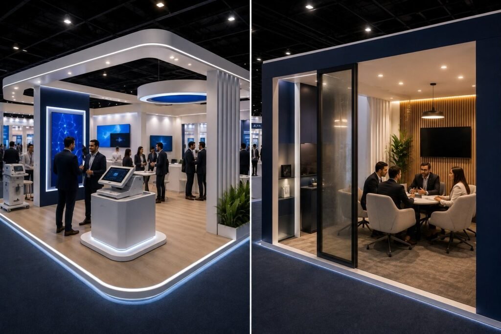
A healthcare booth cannot afford to disappear behind walls. Visitors need to understand what the company offers before they decide whether to stop. Products, demonstrations and a clear brand message should be visible from the aisle, particularly when people are moving quickly between stands. At the same time, not every useful conversation is suitable for an open exhibition floor. A visitor may start by asking a simple question about a medical device and then move into a discussion about specifications, purchasing requirements or implementation. A distributor may want to talk about commercial terms. A hospital representative may need to discuss a particular requirement in more detail. These conversations can take longer and may need a quieter setting than the front of the booth can provide. This creates a basic design tension: More openness improves visibility and accessibility. More enclosure can improve discretion and concentration. The problem is that pushing too far in either direction creates its own drawback. A completely open booth may attract plenty of visitors but leave the team with nowhere suitable for a serious conversation. On the other hand, a booth divided into several enclosed rooms may provide privacy while making the stand harder to approach and reducing the visibility of the products it is meant to showcase.


There is also a practical issue that is easy to overlook: privacy is affected by more than walls. A meeting table positioned beside a large demonstration screen may still be uncomfortable for a sensitive conversation because of noise and constant movement. Likewise, a beautifully enclosed room can be poorly planned if visitors have to cross through a meeting area to reach the main display. So the objective is not to make every part of the booth equally open or equally private. It is to give each activity the environment it needs while keeping the overall stand connected. That means the product display can remain visible, demonstrations can stay accessible, and more focused conversations can move gradually into spaces with greater separation. This is where zoning becomes important: instead of treating the booth as one open room or a collection of closed rooms, the layout can use different levels of access for different visitor interactions.

Open, Semi-Private or Private? Choosing the Right Level of Access
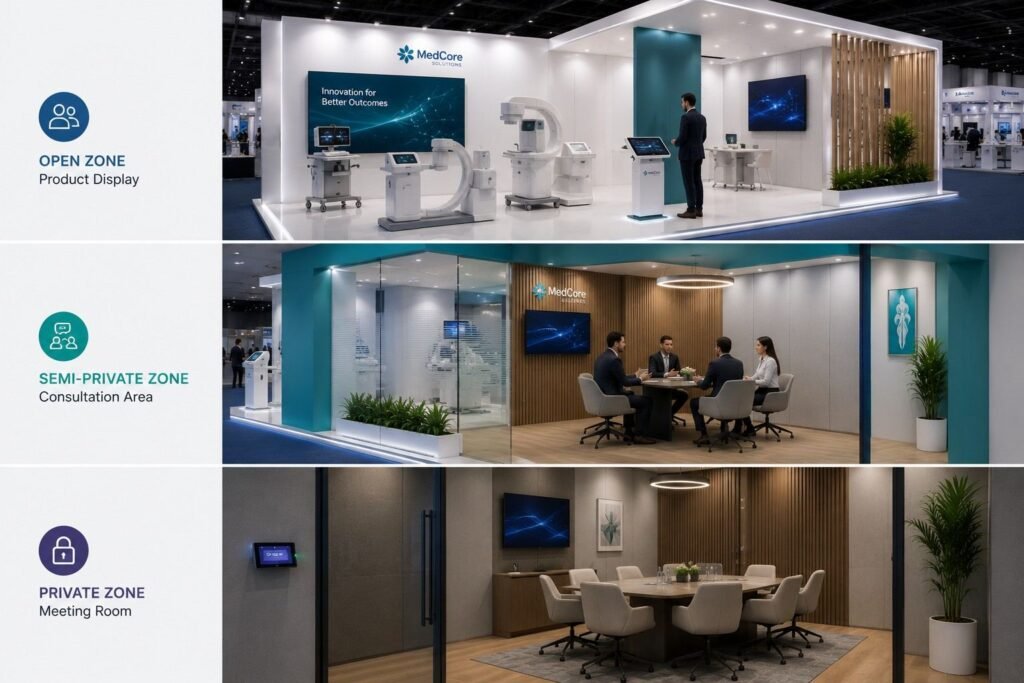
Open, Semi-Private or Private, which one to choose

Not every conversation at a healthcare exhibition needs the same degree of separation. A visitor asking about a product specification can usually speak with a team member in the open area. A longer technical discussion may be more comfortable with some visual separation, while a procurement or commercial conversation may need a genuinely private setting. This is why a useful healthcare exhibition booth layout can be thought of as a three-level privacy spectrum: open, semi-private and private.


Open: For discovery and first contact

Open areas should make it easy for people to approach the booth without feeling that they have to enter a designated meeting space. They work well for product discovery, initial questions, brand introductions and demonstrations that benefit from visibility. The key is accessibility. A visitor should be able to understand what is being presented and approach a member of the team without navigating around furniture or partitions.


Semi-private: For focused conversations

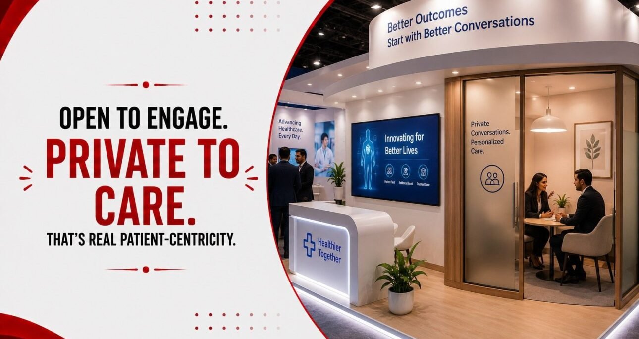
A semi-private area creates a little distance from the main exhibition floor without completely disconnecting the visitor from the stand. This can work well for technical explanations, product consultations and conversations that need more concentration but do not require complete confidentiality. The separation might come from the orientation of furniture, a partial partition, glass, shelving or another visual buffer rather than a conventional meeting room. For many medium and smaller booths, this middle ground can be particularly useful because it provides some separation without consuming too much floor space.


Private: For conversations that require discretion

A fully private area has a different purpose. It is intended for conversations where being overheard or constantly interrupted could become a problem. This might include procurement discussions, pricing, distributor negotiations, partnerships or sensitive commercial information. In these cases, a proper meeting room or enclosed consultation area can be justified. The important point is that privacy should follow the purpose of the conversation. A booth does not become better simply because it has more enclosed space. If every interaction is pushed into private rooms, the stand can lose the openness that encourages visitors to stop in the first place.

Visitor interaction

Suitable level of access

Brand discovery

Open

Product browsing

Open

Initial questions

Open

Live demonstration

Open or semi-private

Technical discussion

Semi-private

Detailed consultation

Semi-private or private

Procurement discussion

Private

Pricing or commercial negotiation

Private

Distributor or partnership meeting

Private


This approach gives the design team a more useful starting point than simply deciding whether the booth should be “open” or “closed.” The question becomes how much separation does each interaction actually need? That distinction is what allows a healthcare exhibition booth to remain welcoming from the aisle while still supporting conversations that need more time, concentration or discretion.

What Should Stay Open on a Healthcare Exhibition Booth?

The part of the booth facing the aisle should answer a visitor’s first question quickly: What does this company offer, and is it relevant to me?. That means the most important products, services, and messages should not be hidden behind meeting rooms or partitions. A visitor should be able to understand the booth’s purpose from outside it, even before speaking to a member of the team.


Put the products people need to notice first in clear view

If the company is exhibiting a medical device, diagnostic system or healthcare technology, the main product should have a visible position rather than being tucked into a corner. The same applies to product categories. If several solutions are being presented, the display should make their relationship clear instead of asking visitors to read a large amount of technical information before they know what they are looking at. A useful rule is simple: the closer something is to the visitor’s first line of sight, the less explanation it should require to understand its relevance.


Keep demonstrations accessible

Demonstrations work best when visitors can see what is happening without having to enter a restricted area. For a medical device, this could mean leaving enough space for a staff member to operate the equipment while one or two visitors watch. For healthcare software, it could mean positioning a screen where a passer-by can see the purpose of the demonstration without blocking the person using it. The demonstration area also needs enough clearance for people to stop without creating a queue across the main circulation path.


Make the brand message visible before the details

Healthcare exhibitions can involve complex products, but the booth does not need to explain everything from the aisle. The exterior-facing message should establish the broader proposition first. Detailed specifications, technical documents and longer explanations can come later when a visitor has shown interest. This prevents a common problem: filling the most visible walls with so much information that the main message becomes difficult to identify.


Protect the main sightlines

Before finalising the layout, look at the booth from the perspective of someone walking past it.

  • Can they see the main product?
  • Can they tell where to enter?
  • Can they see that demonstrations are taking place?
  • Can they recognise the company without having to stop and read a wall?

These questions are more useful than simply asking whether the booth looks attractive in a 3D render. A reception counter, tall partition or enclosed meeting room can unintentionally become a visual barrier. If it blocks the product or demonstration area, the booth may lose some of its ability to attract visitors from the aisle.


Leave room for spontaneous interaction

Not every visitor arrives with a scheduled appointment. Some will stop because they notice a product, hear a demonstration or recognise a solution that is relevant to their work. The open area should therefore have enough breathing room for an unscheduled conversation to happen without interfering with people already using the booth. That does not mean leaving the entire front empty. It means resisting the temptation to fill every available metre with furniture, displays or branding. The open part of a healthcare exhibition booth has one primary job: make discovery easy. Once a visitor wants a deeper conversation, the layout can guide them toward a more suitable consultation setting rather than trying to handle every interaction in the same space.

When Does a Healthcare Exhibition Conversation Actually Need Privacy?

Not every conversation at a healthcare exhibition needs a meeting room. In fact, trying to make every interaction private can make a booth harder to approach and leave less room for the products themselves. Think about how a typical conversation develops. Someone may stop to ask how a medical device works or whether a particular feature is available. That can usually happen beside the product. If the discussion moves into integration, specifications or how the solution would fit into a hospital’s requirements, a quieter place may be more useful. The same applies to commercial conversations. A distributor might start with a general introduction and then move on to territory, pricing or partnership terms. A procurement representative may want to discuss budgets or purchasing requirements. Once the subject becomes more sensitive, sitting at an open table in the middle of a busy aisle is not ideal.


Let the conversation determine the space

Before putting a meeting room into the floor plan, look at the conversations the sales team actually expects to have. A quick product question doesn’t need much separation. A technical discussion may benefit from a little distance from the main visitor traffic. A pricing conversation or distributor negotiation may call for a more private setting. There is no fixed rule that says a particular type of visitor always needs a particular type of space. A clinician discussing general product functionality may be perfectly comfortable in an open area, while the same person discussing a specific purchasing requirement may prefer more privacy. The subject matters more than the job title.


Meeting length changes the requirement

Time is another useful indicator. A visitor standing for two or three minutes while looking at a product can comfortably have a conversation in an open area. Someone sitting down for half an hour needs a different environment. They are likely to notice background noise, people walking behind them and interruptions much more quickly. This is why a booth designed for short, spontaneous interactions should not automatically copy the meeting-room arrangement of a much larger stand.


Look at who is actually using the booth

Healthcare exhibitions can attract a mixture of clinicians, hospital teams, procurement professionals, distributors, technology partners and senior decision-makers. Their reasons for stopping at the booth can be completely different. One visitor may want to see the product in action. Another may arrive specifically for a scheduled business meeting. Someone else may simply be comparing solutions before deciding which companies to contact later. Trying to give all of these visitors the same meeting experience usually makes the layout less flexible.


Ask what would be uncomfortable to discuss in the open

This is probably the simplest test. If the booth mainly handles product introductions and general questions, a large enclosed room may be unnecessary. If the team regularly discusses pricing, procurement, commercial agreements or information that should not be overheard, more separation becomes worthwhile. The point is not to create as much privacy as possible. It is to give the conversation the right setting at the right point in the visitor’s journey. Sometimes that means staying beside the product. Sometimes it means moving to a quieter table. And sometimes it means closing a door.

How to Create a Semi-Private Consultation Area Without Closing the Booth
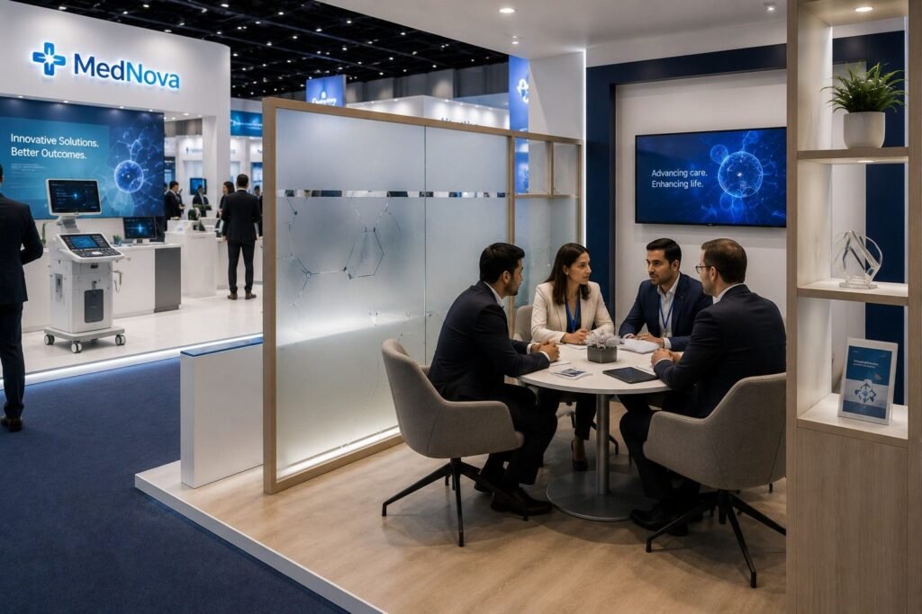
A semi-private consultation area can be one of the most useful spaces in a healthcare exhibition booth, particularly when a fully enclosed meeting room would take up too much of the available floor area. The idea is simple: create enough separation for a focused conversation while keeping the space visually connected to the rest of the stand. This can be achieved without building a conventional room.


Use glass when visibility still matters

Glass can provide a useful middle ground when the company wants a defined meeting area without making it visually disappear. Clear glass keeps the space connected to the booth, while frosted or patterned sections can reduce direct visibility where greater discretion is needed. It can also help maintain a sense of openness in smaller stands, where solid walls may make the footprint feel tighter.


Use partial barriers instead of full walls

A partial-height partition can define a consultation area without cutting it off completely. Visitors can still see activity elsewhere in the booth, while the people seated inside have some distance from passing foot traffic. The height and position matter. A barrier that is too low may provide almost no visual separation, while a tall solid wall can make the area feel like a closed room.


Let furniture create the boundary

Privacy does not always need to come from construction. The position of a table and chairs can change how exposed a conversation feels. Turning seating away from the main aisle, placing a table against a side wall or using a display unit as a visual buffer can create separation without adding another wall. This is particularly useful when the booth needs to remain flexible.


Consider angled layouts

A meeting table facing directly towards the aisle can leave visitors feeling as though they are sitting in the middle of the exhibition floor. Changing the angle can make a surprisingly large difference. A slightly turned seating arrangement can direct the conversation towards the booth while reducing the number of people passing directly in front of the participants. This is a simple spatial decision, but it can improve the sense of separation without consuming additional floor area.


Use shelving and displays as visual filters

Open shelving, product displays or carefully positioned graphic panels can act as a screen between a consultation table and the main visitor path. The advantage is that the same element can perform two jobs: displaying something useful while reducing direct visual exposure to the people sitting behind it. The display should not become so tall or dense that it blocks the booth completely. The objective is filtering, not hiding.


Don’t forget sound

Visual screening is only part of the equation. A consultation area beside a large LED display, product demonstration or presentation speaker may still feel exposed because conversations can be interrupted or overheard. Where possible, place semi-private seating away from the loudest parts of the booth. Acoustic panels, upholstered surfaces and other sound-absorbing elements can also help reduce the amount of noise reaching the conversation area. The solution does not need to make the booth silent. It needs to make a focused conversation reasonably comfortable.


Keep the space easy to enter

A semi-private area should feel separate, not restricted. Visitors should be able to move into the space naturally without squeezing between furniture or feeling as though they are entering a staff-only area. Leave a clear approach route and avoid using partitions to create awkward corners. That balance is what makes semi-private consultation areas so effective. They give a conversation some breathing room without sacrificing the openness that makes an exhibition booth approachable in the first place.

Where Should the Private Consultation Area Go?

No single position works for every healthcare exhibition booth. A private consultation area that works well in a large island stand may be impractical in a small corner booth. The better approach is to place it according to visitor movement, noise, visibility and the type of meetings it needs to support.


At the rear of the booth

The rear is often useful when the booth needs a clear progression from public interaction to a more focused conversation. Visitors can first encounter the brand and products near the aisle, move through a demonstration or discussion, and then continue towards the meeting area if the conversation becomes more detailed. The trade-off is visibility. A meeting room at the rear should not become a tall visual block that hides the main product display.


In a corner

A corner can naturally provide some separation because fewer people approach it from multiple directions. It can be especially useful for a compact meeting table or semi-enclosed consultation space. The surrounding booth structure can provide part of the visual boundary without requiring additional construction. But corners should not automatically become storage or meeting areas. If the corner has one of the booth’s best sightlines, using it for a closed room could hide an important product or message.


Along a side wall

A side-wall position can work well when the booth has more than one open side. It allows one part of the stand to remain dedicated to visitor-facing activity while the consultation space occupies a quieter edge. This can also make it easier to separate meetings from the main circulation route. The exact arrangement depends on which side receives the most foot traffic. A side wall facing the busiest aisle may offer less privacy than its position on the floor plan suggests.


Near the centre

A central meeting area can make sense in a larger booth where several visitor zones need to connect around it. It can also make the consultation space easy for staff to reach from different parts of the stand. The risk is that a central meeting table can interfere with circulation. Visitors may have to walk around it, staff may cross through conversations, and the booth can quickly feel crowded during busy periods.


Away from the loudest activity

Location should not be judged only from a top-down floor plan. Consider what is happening around the consultation area. A private room next to a product demonstration with repeated audio, a presentation screen or heavy visitor traffic may provide visual separation while doing little for conversational comfort. Where possible, place longer meetings away from the booth’s main noise sources.


Protect the main product sightline

Before approving the final position, stand outside the booth and look in. If the consultation structure is the first thing visitors see, ask whether it is hiding the product or message that should attract them. A useful layout usually allows the visitor to understand the booth’s purpose first and discover the consultation area as they move further into the space.

Designing for Visual, Acoustic and Psychological Privacy

A consultation area can look private on a floor plan and still feel exposed once the exhibition opens. Visitors are surrounded by movement, conversations, screens, demonstrations and people passing within a few metres of them. That is why privacy in a healthcare exhibition booth should be considered in more than one dimension.


Visual privacy

The first question is straightforward: how much of the conversation should other visitors be able to see? A completely open table offers little separation. A solid wall offers much more. Between those two options are approaches such as frosted glass, angled partitions, screens, shelving and partial-height panels. The right choice depends on what is being discussed. For a routine product explanation, complete visual separation may be unnecessary. For a more sensitive conversation, reducing direct sightlines can make the visitor more comfortable without necessarily enclosing the entire space. The direction of the seating matters too. Two people facing each other with their backs to the aisle will generally feel less exposed than a conversation taking place directly towards passing traffic.


Acoustic privacy

Sound is often overlooked because it is harder to show in a 3D booth render. A meeting area may have walls around it and still be a poor place for conversation if it sits beside a loud product demonstration or presentation screen. Visitors may have to repeat themselves, conversations may be overheard, and longer meetings can become tiring. Acoustic planning can involve:

  • Keeping meeting areas away from major AV sources
  • Using sound-absorbing wall treatments
  • Introducing upholstered furniture or other softer surfaces
  • Reducing unnecessary hard reflective surfaces
  • Separating high-energy demonstrations from longer meetings

The goal is not to create a completely silent room. Exhibition halls are rarely silent. The aim is to create an environment where people can speak comfortably without competing with the booth’s own activities.


Psychological privacy

There is also a less obvious question: Does the visitor feel comfortable talking here? A consultation table positioned in the middle of a busy walkway may technically have enough space around it, but the people sitting there can still feel as though they are on display. Small design decisions can change that perception. A defined seating arrangement, a visual screen, a quieter corner, appropriate lighting or a clear boundary can signal that the conversation has its own space. This matters particularly when the discussion is moving from a general product introduction towards a more serious business conversation.


Privacy should not become isolation

There is a point where privacy starts working against the booth. If a consultation room is completely hidden, visitors may not realise that meeting space is available. Staff may also find it harder to notice when a visitor is waiting for assistance. The strongest layouts usually maintain some connection between the private area and the rest of the booth. A visitor should feel that they have moved into a more appropriate setting for the conversation, not that they have disappeared from the exhibition entirely.


Check privacy from the visitor’s seat

One practical test is to sit in the consultation area and look outward.

  • What can you see?
  • Who can see you?
  • What can you hear?
  • What is happening immediately outside the space?

This simple exercise can reveal problems that are easy to miss when reviewing a plan or 3D visual from above. Good privacy is therefore not about building the highest walls possible. It is about controlling sight, sound and the visitor’s sense of exposure while keeping the consultation area connected to the wider booth.

Connecting Displays, Demonstrations and Consultations Through Visitor Flow
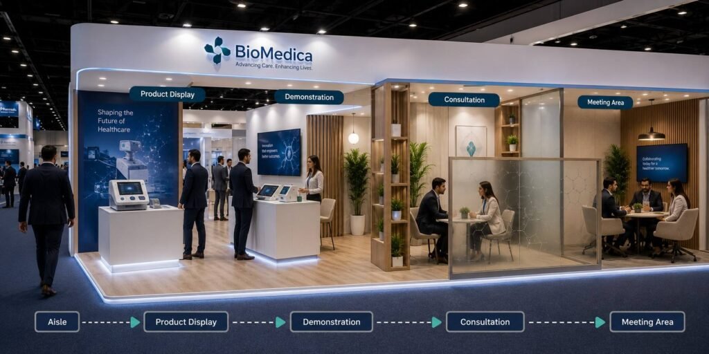
A healthcare exhibition booth should feel easy to move through. Visitors should be able to spot the main product, understand what the company offers, watch a demonstration and move into a conversation without having to navigate around furniture or meeting rooms. A simple way to think about the journey is: Aisle → Discover → Demonstrate → Discuss → Follow up. It is not a fixed route. Some visitors will head straight to a scheduled meeting, while others may browse first. The layout simply needs to support both.


Keep the entrance open

The first few steps into the booth should feel inviting. A large reception counter, tall display or misplaced meeting table can make the entrance feel blocked before the visitor has even seen the product. Give people room to step in, look around and decide where they want to go.


Let the product do some of the work

The main display should be visible from the aisle. Visitors should not have to read a wall of text to understand what the booth is about. A good demonstration can then turn that initial interest into a conversation. Just make sure people gathering around the demo do not block the entrance or another display.


Make the move to consultation easy

When a visitor wants to discuss something in more detail, there should be an obvious place to continue the conversation. It might be a small consultation table, a semi-private seating area or a private meeting room. What matters is that the visitor can reach it without crossing through another busy part of the booth.


\Remember the staff

Visitor flow is only half the picture. Staff also need to move between products, storage, demonstrations and meetings throughout the day. If they have to repeatedly cross the main visitor path to collect brochures or equipment, congestion will build quickly. The best layouts usually make these movements feel almost invisible. Good visitor flow is simple: visitors should always have a clear next step, while the booth remains comfortable for everyone already inside.


How Much Space Should a Consultation Area Take?

There is no fixed amount of booth space that needs to be reserved for consultations. It depends on how many meetings the team expects, how long they usually last and how many people will be involved. A booth built around quick product demonstrations may only need a small consultation table. A company expecting regular procurement or distributor meetings will need more room and better separation. Before deciding on the footprint, ask:

  • How many meetings are expected each day?
  • How long will they usually last?
  • How many people will sit together?
  • Will documents, screens or products be used during the discussion?
  • Are meetings mostly scheduled or spontaneous?


Give people room, not just furniture

A table and four chairs may fit neatly on a floor plan, but that does not mean the area will feel comfortable once people are using it. Allow enough space for visitors to pull out chairs, sit down, stand up and move around without blocking nearby circulation. The same applies to accessibility. Someone using the consultation area should not have to squeeze between furniture or move a chair just to get in or out.


Don’t let meetings take over the booth

More seats do not automatically mean a better booth. If another meeting table means reducing the product display, narrowing the demonstration area or creating a crowded walkway, it may not be worth adding. Look at how the space will actually be used throughout the day. If most conversations are short, flexible seating may be more useful than several permanent meeting rooms. Previous exhibition experience can help here. If the company has exhibited before, check which meeting areas were busy, where visitors tended to wait and whether staff struggled with space. The goal is not to fit as many meetings as possible. It is to provide enough comfortable consultation space without taking away from the parts of the booth that attract and engage visitors.

Common Healthcare Exhibition Booth Design Mistakes

A healthcare exhibition booth can look polished in a render and still perform poorly once visitors, staff, products and equipment occupy the space. Many problems only become obvious when the stand is busy. The following mistakes are worth checking before construction begins.


1. Using walls to solve every problem

Adding another partition is an easy way to create separation, but it is not always the best answer. Too many solid elements can reduce visibility, make the booth harder to approach and consume space that could have been used for product interaction. Before adding a wall, consider whether furniture positioning, glass, shelving or a partial screen could achieve the same purpose.


2. Hiding the main product

A booth exists to communicate something. If the primary medical device or healthcare solution is hidden behind a meeting room, tall reception desk or oversized graphic structure, visitors may never get the visual cue that encourages them to stop. The main product should have a clear relationship with the aisle and the primary visitor approach.


3. Putting consultation areas beside noisy demonstrations

A consultation area and a demonstration zone can both be valuable, but placing them immediately beside one another can create problems. A product demo may involve repeated explanations, videos or audio. A longer business conversation needs a very different environment. If the two activities have to share a boundary, consider how sound and visitor movement will affect the people sitting at the consultation table.


4. Creating bottlenecks around meeting furniture

A table may fit neatly on a floor plan and still cause congestion. Check what happens when people are sitting down, standing up, carrying brochures or moving around the table. Then consider the people passing behind them. The clearance around furniture is part of the circulation plan.


5. Filling the booth with information

Healthcare products can involve complicated technical information, but displaying everything does not necessarily make the booth clearer. Long blocks of text, dense specifications and multiple competing messages can make it difficult for visitors to understand what deserves their attention first. Use the booth to establish the main message and create opportunities for deeper explanations when visitors show interest.


6. Forgetting storage

Storage is easy to overlook because it is not part of the visitor-facing experience. But brochures, personal belongings, packaging, demonstration equipment and spare materials have to go somewhere. Without adequate storage, staff may end up leaving items behind counters, beside displays or under tables, gradually making an otherwise well-designed booth look untidy.

Healthcare Exhibition Booth Design Checklist

Before a healthcare exhibition booth moves from concept to fabrication, review the layout from both a design and operational perspective. The following checklist can help identify problems before they become difficult or expensive to change.

Stage

What to Check

Why It Matters

Before design

Confirm booth footprint, dimensions and number of open sides

Determines what can realistically fit and how visitors will approach the booth

Before design

Check venue and organiser restrictions

Prevents layout changes caused by height, structural, electrical or installation requirements

Before design

Identify primary visitor groups

Helps determine whether the booth needs to prioritise clinicians, procurement teams, distributors, partners or other audiences

Before design

Define the types of conversations expected

Helps determine which interactions can remain open and which need semi-private or private space

Before design

List products and demonstrations

Ensures important products have adequate visibility and enough operating space

Before design

Estimate meeting volume and duration

Helps determine how much consultation and meeting space is actually needed

Layout development

Keep the main product visible from the aisle

Prevents meeting rooms, counters or partitions from hiding the booth’s primary offering

Layout development

Create an easy point of entry

Makes the booth approachable and reduces unnecessary barriers

Layout development

Choose the appropriate privacy level

Prevents the booth from becoming either too exposed or unnecessarily enclosed

Layout development

Protect circulation around furniture and displays

Gives visitors and staff enough room to move comfortably

Layout development

Separate noisy and quiet activities

Helps prevent demonstrations and AV from disrupting consultations

Layout development

Plan staff movement

Reduces unnecessary staff traffic through visitor areas

Layout development

Include adequate storage

Keeps brochures, samples, equipment and personal belongings out of sight

Layout development

Consider accessibility

Ensures entrances, seating and circulation can be used comfortably by different visitors

Layout development

Check the booth from multiple viewpoints

A structure that works from one aisle may block visibility from another

Before fabrication

Review the 3D design at human scale

Furniture and people can make a space feel very different from how it appears in a render

Before fabrication

Test sightlines

Confirms that partitions, meeting rooms and branding elements do not obscure important products

Before fabrication

Review the sound environment

Identifies potential noise conflicts between consultation areas, demonstrations and AV

Before fabrication

Check furniture clearances

Ensures people can sit, stand and move without obstructing circulation

Before fabrication

Review the visitor journey

Confirms that discovery, demonstration, consultation and follow-up connect naturally

Before fabrication

Confirm practical services

Ensures power, lighting, AV, internet and other technical requirements are accounted for

Before opening

Walk through the completed booth from the aisle

Tests whether the company and its main offering are immediately understandable

Before opening

Test every demonstration

Confirms that the complete setup works rather than assuming individual components will work together

Before opening

Sit in the consultation areas

Reveals issues with visibility, noise, comfort and perceived privacy

Before opening

Check signage from different approaches

Ensures important messages remain visible from relevant visitor routes

Before opening

Observe circulation during setup

Helps identify bottlenecks caused by furniture, queues or demonstrations

Before opening

Remove unnecessary clutter

Keeps the visitor-facing areas professional and easy to navigate

Conclusion

A healthcare exhibition booth does not have to be completely open or completely enclosed. The stronger approach is to decide what each part of the booth needs to help visitors do. Keep products and demonstrations visible where discovery matters. Use semi-private areas when a conversation needs more focus, and reserve fully private spaces for discussions where confidentiality genuinely matters. The balance will vary from one exhibition to another. A compact medical booth may work better with an open display and a screened consultation table, while a larger healthcare stand with scheduled procurement meetings may justify dedicated meeting rooms. The important thing is to design privacy into the visitor journey rather than adding a meeting room as an afterthought. The best healthcare exhibition booth design is not the one with the most open space or the most private rooms. It is the one that makes each interaction feel appropriate, accessible and purposeful from the first glance at the aisle to the final business conversation.

FAQs

1. How can a booth provide privacy without making the entrance feel blocked?

Keep the first visual zone relatively open and place privacy elements deeper within the booth. Partial screens, angled partitions or open shelving can define a consultation area without creating a solid wall directly at the entrance. The visitor should be able to see activity inside the booth before encountering any separation.

For conversations that need some discretion, seating usually works better when it is oriented towards the booth rather than directly towards passing traffic. This reduces the feeling of being on display and can make the conversation more comfortable. The final orientation should still allow staff to notice approaching visitors.

Separate the two activities by function rather than simply placing them in different corners. The demonstration should remain accessible and visible, while longer meetings should be positioned away from the demonstration’s main sound and traffic. A partial partition or change in furniture orientation can create enough separation without disconnecting the two areas.

The visitor should be able to identify the company, understand its main offering and see the most important product or demonstration without entering the booth. Detailed specifications and lengthy explanations can be handled once the visitor shows interest. The exterior view should create a reason to step inside rather than attempt to communicate everything at once.

Check the room from every major aisle before finalising the design. Its height, position, wall treatment and relationship to the main product display can all affect sightlines. If the room hides the product that is supposed to attract visitors, consider moving it, reducing the enclosure or using a more transparent treatment.

A compact arrangement with two or three seats can work well for short discussions, provided people can enter and leave without crossing the main circulation path. A small round or appropriately sized table can feel less formal than a large boardroom-style setup and takes up less floor area.

Keep scheduled meetings from taking over the public-facing space. A dedicated meeting area can handle appointments while the open portion of the booth remains available for visitors who arrive without one. Where space is limited, flexible consultation furniture can allow the same area to support different types of conversations throughout the day.

Consider the approach route, available clearance, seating height, table position and ease of movement around the area. The consultation space should not require visitors to squeeze between furniture or navigate an unnecessarily narrow entrance. Accessibility should be incorporated into the layout rather than added after the main design is complete.

Lighting can help establish a visual distinction between areas without enclosing them. A consultation space can use softer, more controlled lighting than a high-energy demonstration zone, helping signal a change in activity. At the same time, the area should remain well lit enough for comfortable conversation and viewing documents or products.

No, a short product discussion, technical consultation and commercial negotiation can have very different privacy requirements. Designing every meeting space to the highest level of privacy can consume unnecessary floor area. A mix of open, semi-private and private settings gives the team more flexibility.